

書接上回,我們的Fluent WPF的版圖已經完成了:
- Fluent Window: WPF 模擬UWP原生窗口樣式——亞克力|雲母材質、自定義標題欄樣式、原生DWM動畫 (附我封裝好的類)
- Fluent Popup & ToolTip: WPF中為Popup和ToolTip使用WindowMaterial特效 win10/win11
- Fluent ScrollViewer: WPF 使用CompositionTarget.Rendering實現平滑流暢滾動的ScrollViewer,支持滾輪、觸控板、觸摸屏和筆
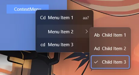
先來看看效果圖(win11):
有以下xaml代碼:
 <TextBlock.ContextMenu>
     <ContextMenu>
         <MenuItem Header="Menu Item 1" Icon="Cd" InputGestureText="aa?" />
         <MenuItem Header="Menu Item 2" >
             <MenuItem Header="Child Item 1" Icon="Ab" />
             <MenuItem Header="Child Item 2" Icon="Ad" />
             <MenuItem Header="Child Item 3" IsCheckable="True" IsChecked="True"/>
         </MenuItem>
         <MenuItem Header="Menu Item 3" Icon="cd" />
     </ContextMenu>
 </TextBlock.ContextMenu>
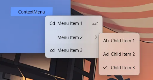
(由於我的win10虛擬機壞了,暫時沒有測試)
前面的工作已經解決了讓任意窗口支持Acrylic材質的問題,本文重點介紹ContentMenu和MenuItem的樣式適配和實現。
本文的Demo:
TwilightLemon/WindowEffectTest: 測試win10/11的模糊效果 (github.com)
一、為什麼需要一個新的ContextMenu和MenuItem模板
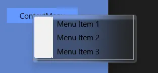
如果你直接給ContextMenu應用WindowMaterial特效,可能會出現以下醜陋的效果:
或者:
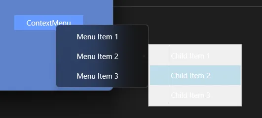
原因在於古老的ContextMenu和MenuItem模板和樣式並不能通過簡單修改Background實現我們想要的佈局和交互效果。
二、ContextMenu與MenuItem的結構
1. ContextMenu 的結構
ContextMenu直觀上看是一個Popup,但它的控件模板並不包含Popup,而是直接指定內部元素(包含一個ScrollViewer和StackPanel)。因此不能從控件模板中替換Popup為自定義的FluentPopup,需要使用其他手段讓其內部Popup也支持Acrylic材質(見下文)。
2. MenuItem 的四種形態
在示例代碼倉庫中展示了較為完整的Menu相關的結構:
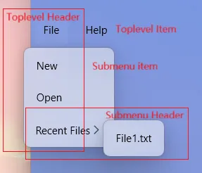
MenuItem根據其在菜單樹中的位置,通過Role屬性分為四種形態。我們在Style.Triggers中分別為它們指定了不同的模板:
- TopLevelHeader: 頂級菜單項,且包含子菜單
Popup(例如菜單欄上的”File”)。 - TopLevelItem: 頂級菜單項,不含子菜單(例如菜單欄上的”Help”)。
- SubmenuHeader: 子菜單項,且包含下一級子菜單
Popup。 - SubmenuItem: 子菜單項,不含子菜單(葉子節點)。其模板主要處理圖標、文字、快捷鍵的佈局。
三、重寫Menu相關控件模板和樣式
1. ContextMenu 樣式
ContextMenu的樣式主要參考了.NET 9自帶的Fluent樣式,並作了一些調整以適配Acrylic材質。主要目的是覆蓋原始模板的Icon部分白框和分割線:
因為我們的WindowMaterial已經為窗口自動附加上圓角、陰影和亞克力材質的DWM效果,所以我們只需要將ContextMenu的背景設置為透明,並移除不必要的邊框和分割線即可。
此外,還添加了彈出動畫(是在Popup內部做的,並非對window,效果可能不會很理想)。
2. MenuItem 樣式
MenuItem的樣式主要處理了圖標、文字、快捷鍵的佈局,並根據不同的角色(TopLevelHeader、TopLevelItem、SubmenuHeader、SubmenuItem)應用不同的模板。
- TopLevelHeader: 只包含Icon和Header,以及彈出的Popup,只需要替換為自定義的FluentPopup即可。
- TopLevelItem: 只包含Icon和Header,無Popup。
- SubmenuHeader: 包含Icon、Header和Chevron圖標(這裏就是一個展開的箭頭圖標,但是官方叫做雪佛龍..?),以及彈出的Popup,同樣替換為FluentPopup。
- SubmenuItem: 葉子節點,包含Icon、Header和InputGestureText。 其模板主要處理圖標、文字、快捷鍵的佈局。
菜單項主要分為三個部分:Icon圖標、Header文字和最右側的提示文字或展開箭頭圖標。只需要保持三個部分的佈局對其即可。如果IsCheckable為True,則Icon部分被自定義圖標占據(√, 當IsChecked為True時)。
以下是完整的資源字典,包含了完整的註釋。


1 <ResourceDictionary 2 xmlns="http://schemas.microsoft.com/winfx/2006/xaml/presentation" 3 xmlns:x="http://schemas.microsoft.com/winfx/2006/xaml" 4 xmlns:local="clr-namespace:WindowEffectTest" 5 xmlns:sys="clr-namespace:System;assembly=mscorlib"> 6 7 <!-- 菜單邊框內邊距 --> 8 <Thickness x:Key="MenuBorderPadding">0,3,0,3</Thickness> 9 10 <!-- 菜單項外邊距 --> 11 <Thickness x:Key="MenuItemMargin">4,1</Thickness> 12 13 <!-- 菜單項內容內邊距 --> 14 <Thickness x:Key="MenuItemContentPadding">10,6</Thickness> 15 16 <!-- 頂級菜單項外邊距 --> 17 <Thickness x:Key="TopLevelItemMargin">4</Thickness> 18 19 <!-- 頂級菜單項內容邊距 --> 20 <Thickness x:Key="TopLevelContentMargin">10</Thickness> 21 22 <!-- 菜單圓角半徑 --> 23 <CornerRadius x:Key="MenuCornerRadius">4</CornerRadius> 24 25 <!-- 頂級菜單圓角半徑 --> 26 <CornerRadius x:Key="TopLevelCornerRadius">6</CornerRadius> 27 28 <!-- 菜單動畫持續時間 --> 29 <Duration x:Key="MenuAnimationDuration">0:0:0.167</Duration> 30 31 <!-- 複選標記圖標路徑數據 --> 32 <PathGeometry x:Key="CheckGraph"> 33 M392.533333 806.4L85.333333 503.466667l59.733334-59.733334 247.466666 247.466667L866.133333 213.333333l59.733334 59.733334L392.533333 806.4z 34 </PathGeometry> 35 36 <!-- 前進箭頭圖標路徑數據(用於子菜單指示器) --> 37 <PathGeometry x:Key="ForwardGraph"> 38 M283.648 174.081l57.225-59.008 399.479 396.929-399.476 396.924-57.228-59.004 335.872-337.92z 39 </PathGeometry> 40 41 <!-- 菜單項ScrollViewer樣式 --> 42 <Style 43 x:Key="MenuItemScrollViewerStyle" 44 BasedOn="{StaticResource {x:Type ScrollViewer}}" 45 TargetType="{x:Type ScrollViewer}"> 46 <Setter Property="HorizontalScrollBarVisibility" Value="Disabled" /> 47 <Setter Property="VerticalScrollBarVisibility" Value="Auto" /> 48 </Style> 49 50 <!-- 默認集合焦點視覺樣式 得到鍵盤焦點時顯示 --> 51 <Style x:Key="DefaultCollectionFocusVisualStyle"> 52 <Setter Property="Control.Template"> 53 <Setter.Value> 54 <ControlTemplate> 55 <Rectangle 56 Margin="4,0" 57 RadiusX="4" 58 RadiusY="4" 59 SnapsToDevicePixels="True" 60 Stroke="{DynamicResource AccentColor}" 61 StrokeThickness="2" /> 62 </ControlTemplate> 63 </Setter.Value> 64 </Setter> 65 </Style> 66 67 <!-- 默認上下文菜單樣式 --> 68 <Style x:Key="DefaultContextMenuStyle" TargetType="{x:Type ContextMenu}"> 69 <Setter Property="MinWidth" Value="140" /> 70 <Setter Property="Padding" Value="0" /> 71 <Setter Property="Margin" Value="0" /> 72 <Setter Property="HasDropShadow" Value="False" /> 73 <Setter Property="Grid.IsSharedSizeScope" Value="True" /> 74 <Setter Property="Popup.PopupAnimation" Value="None" /> 75 <Setter Property="SnapsToDevicePixels" Value="True" /> 76 <Setter Property="OverridesDefaultStyle" Value="True" /> 77 <Setter Property="Template"> 78 <Setter.Value> 79 <ControlTemplate TargetType="{x:Type ContextMenu}"> 80 <Border 81 x:Name="Border" 82 Padding="{StaticResource MenuBorderPadding}" 83 Background="{TemplateBinding Background}" 84 BorderBrush="{TemplateBinding BorderBrush}" 85 BorderThickness="{TemplateBinding BorderThickness}"> 86 <!-- 用於動畫的轉換變換 --> 87 <Border.RenderTransform> 88 <TranslateTransform /> 89 </Border.RenderTransform> 90 <ScrollViewer CanContentScroll="True" Style="{StaticResource MenuItemScrollViewerStyle}"> 91 <!-- 菜單項容器 --> 92 <StackPanel 93 ClipToBounds="True" 94 IsItemsHost="True" 95 KeyboardNavigation.DirectionalNavigation="Cycle" 96 Orientation="Vertical" /> 97 </ScrollViewer> 98 </Border> 99 <ControlTemplate.Triggers> 100 <!-- 菜單打開時的動畫效果 --> 101 <Trigger Property="IsOpen" Value="True"> 102 <Trigger.EnterActions> 103 <BeginStoryboard> 104 <Storyboard> 105 <!-- Y軸平移動畫:從-45向下滑入到0 --> 106 <DoubleAnimation 107 Storyboard.TargetName="Border" 108 Storyboard.TargetProperty="(Border.RenderTransform).(TranslateTransform.Y)" 109 From="-45" 110 To="0" 111 Duration="{StaticResource MenuAnimationDuration}"> 112 <DoubleAnimation.EasingFunction> 113 <CircleEase EasingMode="EaseOut" /> 114 </DoubleAnimation.EasingFunction> 115 </DoubleAnimation> 116 </Storyboard> 117 </BeginStoryboard> 118 </Trigger.EnterActions> 119 </Trigger> 120 </ControlTemplate.Triggers> 121 </ControlTemplate> 122 </Setter.Value> 123 </Setter> 124 </Style> 125 126 <!-- 頂級菜單項頭部模板(帶子菜單) --> 127 <ControlTemplate x:Key="{x:Static MenuItem.TopLevelHeaderTemplateKey}" TargetType="{x:Type MenuItem}"> 128 <Border 129 x:Name="Border" 130 Margin="{StaticResource TopLevelItemMargin}" 131 Background="{TemplateBinding Background}" 132 BorderBrush="{TemplateBinding BorderBrush}" 133 BorderThickness="{TemplateBinding BorderThickness}" 134 CornerRadius="{StaticResource TopLevelCornerRadius}"> 135 <Grid> 136 <Grid.RowDefinitions> 137 <RowDefinition Height="*" /> 138 <RowDefinition Height="Auto" /> 139 </Grid.RowDefinitions> 140 141 <!-- 菜單項內容區域 --> 142 <Grid Margin="{StaticResource TopLevelContentMargin}"> 143 <Grid.ColumnDefinitions> 144 <ColumnDefinition Width="Auto" /> 145 <ColumnDefinition Width="*" /> 146 </Grid.ColumnDefinitions> 147 148 <!-- 菜單項圖標 --> 149 <ContentPresenter 150 x:Name="Icon" 151 Grid.Column="0" 152 Margin="0,0,6,0" 153 VerticalAlignment="Center" 154 Content="{TemplateBinding Icon}" 155 SnapsToDevicePixels="{TemplateBinding SnapsToDevicePixels}" /> 156 157 <!-- 菜單項標題 --> 158 <ContentPresenter 159 x:Name="HeaderPresenter" 160 Grid.Column="1" 161 Margin="{TemplateBinding Padding}" 162 VerticalAlignment="Center" 163 ContentSource="Header" 164 RecognizesAccessKey="True" 165 SnapsToDevicePixels="{TemplateBinding SnapsToDevicePixels}" 166 TextElement.Foreground="{TemplateBinding Foreground}" /> 167 </Grid> 168 169 <!-- 子菜單彈出窗口(使用自定義FluentPopup) --> 170 <local:FluentPopup 171 x:Name="PART_Popup" 172 Grid.Row="1" 173 Grid.Column="0" 174 Focusable="False" 175 HorizontalOffset="-12" 176 IsOpen="{TemplateBinding IsSubmenuOpen}" 177 Placement="Bottom" 178 PlacementTarget="{Binding ElementName=Border}" 179 PopupAnimation="None" 180 VerticalOffset="1"> 181 <Grid 182 x:Name="SubmenuBorder" 183 Background="{DynamicResource PopupWindowBackground}" 184 SnapsToDevicePixels="True"> 185 <!-- 子菜單動畫變換 --> 186 <Grid.RenderTransform> 187 <TranslateTransform /> 188 </Grid.RenderTransform> 189 <ScrollViewer 190 Padding="{StaticResource MenuBorderPadding}" 191 CanContentScroll="True" 192 Style="{StaticResource MenuItemScrollViewerStyle}"> 193 <Grid> 194 <!-- 子菜單項呈現器 --> 195 <ItemsPresenter 196 x:Name="ItemsPresenter" 197 Grid.IsSharedSizeScope="True" 198 KeyboardNavigation.DirectionalNavigation="Cycle" 199 KeyboardNavigation.TabNavigation="Cycle" 200 SnapsToDevicePixels="{TemplateBinding SnapsToDevicePixels}" /> 201 </Grid> 202 </ScrollViewer> 203 </Grid> 204 </local:FluentPopup> 205 </Grid> 206 </Border> 207 <ControlTemplate.Triggers> 208 <!-- 無圖標時隱藏圖標區域 --> 209 <Trigger Property="Icon" Value="{x:Null}"> 210 <Setter TargetName="Icon" Property="Visibility" Value="Collapsed" /> 211 </Trigger> 212 <!-- 無標題時隱藏標題並移除圖標邊距 --> 213 <Trigger Property="Header" Value="{x:Null}"> 214 <Setter TargetName="Icon" Property="Margin" Value="0" /> 215 <Setter TargetName="HeaderPresenter" Property="Visibility" Value="Collapsed" /> 216 </Trigger> 217 <!-- 鼠標懸停高亮效果 --> 218 <Trigger Property="IsHighlighted" Value="True"> 219 <Setter TargetName="Border" Property="Background" Value="{DynamicResource MaskColor}" /> 220 </Trigger> 221 <!-- 子菜單打開時的動畫 --> 222 <Trigger Property="IsSubmenuOpen" Value="True"> 223 <Trigger.EnterActions> 224 <BeginStoryboard> 225 <Storyboard> 226 <DoubleAnimation 227 Storyboard.TargetName="SubmenuBorder" 228 Storyboard.TargetProperty="(Border.RenderTransform).(TranslateTransform.Y)" 229 From="-45" 230 To="0" 231 Duration="{StaticResource MenuAnimationDuration}"> 232 <DoubleAnimation.EasingFunction> 233 <CircleEase EasingMode="EaseOut" /> 234 </DoubleAnimation.EasingFunction> 235 </DoubleAnimation> 236 </Storyboard> 237 </BeginStoryboard> 238 </Trigger.EnterActions> 239 </Trigger> 240 </ControlTemplate.Triggers> 241 </ControlTemplate> 242 243 <!-- 頂級菜單項模板(無子菜單) --> 244 <ControlTemplate x:Key="{x:Static MenuItem.TopLevelItemTemplateKey}" TargetType="{x:Type MenuItem}"> 245 <Border 246 x:Name="Border" 247 Margin="{StaticResource TopLevelItemMargin}" 248 Background="{TemplateBinding Background}" 249 BorderBrush="{TemplateBinding BorderBrush}" 250 BorderThickness="{TemplateBinding BorderThickness}" 251 CornerRadius="{StaticResource TopLevelCornerRadius}"> 252 <Grid Margin="{StaticResource TopLevelContentMargin}"> 253 <Grid.ColumnDefinitions> 254 <ColumnDefinition Width="Auto" /> 255 <ColumnDefinition Width="*" /> 256 </Grid.ColumnDefinitions> 257 258 <!-- 圖標區域 --> 259 <ContentPresenter 260 x:Name="Icon" 261 Grid.Column="0" 262 Margin="0,0,6,0" 263 VerticalAlignment="Center" 264 Content="{TemplateBinding Icon}" 265 SnapsToDevicePixels="{TemplateBinding SnapsToDevicePixels}" /> 266 267 <!-- 標題區域 --> 268 <ContentPresenter 269 x:Name="HeaderPresenter" 270 Grid.Column="1" 271 Margin="{TemplateBinding Padding}" 272 VerticalAlignment="Center" 273 ContentSource="Header" 274 RecognizesAccessKey="True" 275 SnapsToDevicePixels="{TemplateBinding SnapsToDevicePixels}" 276 TextElement.Foreground="{TemplateBinding Foreground}" /> 277 </Grid> 278 </Border> 279 <ControlTemplate.Triggers> 280 <!-- 鼠標懸停效果 --> 281 <Trigger Property="IsHighlighted" Value="True"> 282 <Setter TargetName="Border" Property="Background" Value="{DynamicResource MaskColor}" /> 283 </Trigger> 284 <Trigger Property="Icon" Value="{x:Null}"> 285 <Setter TargetName="Icon" Property="Visibility" Value="Collapsed" /> 286 </Trigger> 287 <Trigger Property="Header" Value="{x:Null}"> 288 <Setter TargetName="Icon" Property="Margin" Value="0" /> 289 <Setter TargetName="HeaderPresenter" Property="Visibility" Value="Collapsed" /> 290 </Trigger> 291 </ControlTemplate.Triggers> 292 </ControlTemplate> 293 294 <!-- 子菜單項模板(無子級) --> 295 <ControlTemplate x:Key="{x:Static MenuItem.SubmenuItemTemplateKey}" TargetType="{x:Type MenuItem}"> 296 <Border 297 x:Name="Border" 298 Margin="{StaticResource MenuItemMargin}" 299 Background="{TemplateBinding Background}" 300 BorderBrush="{TemplateBinding BorderBrush}" 301 BorderThickness="{TemplateBinding BorderThickness}" 302 CornerRadius="{StaticResource MenuCornerRadius}"> 303 <Grid Margin="{StaticResource MenuItemContentPadding}"> 304 <Grid.ColumnDefinitions> 305 <!-- 圖標/複選框列,使用共享大小組確保對齊 --> 306 <ColumnDefinition Width="Auto" SharedSizeGroup="MenuItemIconCol" /> 307 <!-- 標題內容列 --> 308 <ColumnDefinition Width="*" /> 309 <!-- 快捷鍵提示列,使用共享大小組確保對齊 --> 310 <ColumnDefinition Width="Auto" SharedSizeGroup="MenuItemRightPartCol" /> 311 </Grid.ColumnDefinitions> 312 313 <!-- 複選框圖標容器 --> 314 <Border 315 x:Name="CheckBoxIconBorder" 316 Grid.Column="0" 317 VerticalAlignment="Center" 318 Visibility="Collapsed"> 319 <Path 320 x:Name="CheckBoxIcon" 321 Width="10" 322 Height="10" 323 HorizontalAlignment="Left" 324 VerticalAlignment="Center" 325 Fill="{TemplateBinding Foreground}" 326 Stretch="Uniform" /> 327 </Border> 328 329 <!-- 自定義圖標 --> 330 <ContentPresenter 331 x:Name="Icon" 332 Grid.Column="0" 333 Margin="0,0,6,0" 334 VerticalAlignment="Center" 335 Content="{TemplateBinding Icon}" 336 SnapsToDevicePixels="{TemplateBinding SnapsToDevicePixels}" /> 337 338 <!-- 菜單項標題內容 --> 339 <ContentPresenter 340 Grid.Column="1" 341 Margin="{TemplateBinding Padding}" 342 VerticalAlignment="{TemplateBinding VerticalContentAlignment}" 343 ContentSource="Header" 344 RecognizesAccessKey="True" 345 SnapsToDevicePixels="{TemplateBinding SnapsToDevicePixels}" 346 TextElement.Foreground="{TemplateBinding Foreground}" /> 347 348 <!-- 快捷鍵提示文本 --> 349 <TextBlock 350 x:Name="InputGestureText" 351 Grid.Column="2" 352 Margin="25,0,0,0" 353 VerticalAlignment="{TemplateBinding VerticalContentAlignment}" 354 DockPanel.Dock="Right" 355 FontSize="11" 356 Opacity="0.67" 357 Text="{TemplateBinding InputGestureText}" /> 358 </Grid> 359 </Border> 360 <ControlTemplate.Triggers> 361 <!-- 高亮狀態(鼠標懸停) --> 362 <Trigger Property="IsHighlighted" Value="True"> 363 <Setter TargetName="Border" Property="Background" Value="{DynamicResource MaskColor}" /> 364 </Trigger> 365 <!-- 無自定義圖標時隱藏圖標區域 --> 366 <Trigger Property="Icon" Value="{x:Null}"> 367 <Setter TargetName="Icon" Property="Visibility" Value="Collapsed" /> 368 </Trigger> 369 <!-- 可複選時顯示覆選框圖標容器 --> 370 <Trigger Property="IsCheckable" Value="True"> 371 <Setter TargetName="CheckBoxIconBorder" Property="Visibility" Value="Visible" /> 372 </Trigger> 373 <!-- 已選中時顯示覆選標記 --> 374 <Trigger Property="IsChecked" Value="True"> 375 <Setter TargetName="CheckBoxIcon" Property="Data" Value="{StaticResource CheckGraph}" /> 376 </Trigger> 377 <!-- 無快捷鍵時隱藏快捷鍵提示 --> 378 <Trigger Property="InputGestureText" Value=""> 379 <Setter TargetName="InputGestureText" Property="Visibility" Value="Collapsed" /> 380 </Trigger> 381 </ControlTemplate.Triggers> 382 </ControlTemplate> 383 384 <!-- 子菜單頭部模板(帶下級子菜單) --> 385 <ControlTemplate x:Key="{x:Static MenuItem.SubmenuHeaderTemplateKey}" TargetType="{x:Type MenuItem}"> 386 <Grid> 387 <Grid.RowDefinitions> 388 <RowDefinition Height="*" /> 389 <RowDefinition Height="Auto" /> 390 </Grid.RowDefinitions> 391 392 <!-- 菜單項外觀 --> 393 <Border 394 x:Name="Border" 395 Grid.Row="1" 396 Height="{TemplateBinding Height}" 397 Margin="{StaticResource MenuItemMargin}" 398 Background="Transparent" 399 CornerRadius="{StaticResource MenuCornerRadius}"> 400 <Grid x:Name="MenuItemContent" Margin="{StaticResource MenuItemContentPadding}"> 401 <Grid.ColumnDefinitions> 402 <ColumnDefinition Width="Auto" SharedSizeGroup="MenuItemIconCol" /> 403 <ColumnDefinition Width="*" /> 404 <ColumnDefinition Width="Auto" SharedSizeGroup="MenuItemRightPartCol" /> 405 </Grid.ColumnDefinitions> 406 407 <!-- 圖標 --> 408 <ContentPresenter 409 x:Name="Icon" 410 Grid.Column="0" 411 Margin="0,0,6,0" 412 VerticalAlignment="Center" 413 Content="{TemplateBinding Icon}" 414 SnapsToDevicePixels="{TemplateBinding SnapsToDevicePixels}" /> 415 416 <!-- 標題 --> 417 <ContentPresenter 418 x:Name="HeaderHost" 419 Grid.Column="1" 420 Margin="{TemplateBinding Padding}" 421 VerticalAlignment="{TemplateBinding VerticalContentAlignment}" 422 ContentSource="Header" 423 RecognizesAccessKey="True" 424 SnapsToDevicePixels="{TemplateBinding SnapsToDevicePixels}" /> 425 426 <!-- 右箭頭指示器(表示有子菜單) --> 427 <Path 428 Grid.Column="2" 429 Width="10" 430 Height="10" 431 Margin="0,0,4,0" 432 HorizontalAlignment="Right" 433 VerticalAlignment="Center" 434 Data="{StaticResource ForwardGraph}" 435 Fill="{TemplateBinding Foreground}" 436 Opacity="0.67" 437 Stretch="Uniform" /> 438 </Grid> 439 </Border> 440 441 <!-- 子菜單彈出窗口(向右展開) --> 442 <local:FluentPopup 443 x:Name="PART_Popup" 444 Grid.Row="1" 445 Focusable="False" 446 IsOpen="{TemplateBinding IsSubmenuOpen}" 447 Placement="Right" 448 PlacementTarget="{Binding ElementName=MenuItemContent}" 449 PopupAnimation="None"> 450 <Grid x:Name="PopupRoot" Background="{DynamicResource PopupWindowBackground}"> 451 <!-- 子菜單動畫變換 --> 452 <Grid.RenderTransform> 453 <TranslateTransform /> 454 </Grid.RenderTransform> 455 <ScrollViewer 456 Padding="{StaticResource MenuBorderPadding}" 457 CanContentScroll="True" 458 Style="{StaticResource MenuItemScrollViewerStyle}"> 459 <!-- 子菜單項容器 --> 460 <ItemsPresenter 461 x:Name="ItemsPresenter" 462 Grid.IsSharedSizeScope="True" 463 KeyboardNavigation.DirectionalNavigation="Cycle" 464 KeyboardNavigation.TabNavigation="Cycle" 465 SnapsToDevicePixels="{TemplateBinding SnapsToDevicePixels}" /> 466 </ScrollViewer> 467 </Grid> 468 </local:FluentPopup> 469 </Grid> 470 <ControlTemplate.Triggers> 471 <!-- 無圖標時優化佈局 --> 472 <Trigger Property="Icon" Value="{x:Null}"> 473 <Setter TargetName="Icon" Property="Visibility" Value="Collapsed" /> 474 <Setter TargetName="Icon" Property="Margin" Value="0" /> 475 </Trigger> 476 <!-- 高亮效果 --> 477 <Trigger Property="IsHighlighted" Value="true"> 478 <Setter TargetName="Border" Property="Background" Value="{DynamicResource MaskColor}" /> 479 </Trigger> 480 <!-- 子菜單打開動畫 --> 481 <Trigger Property="IsSubmenuOpen" Value="True"> 482 <Trigger.EnterActions> 483 <BeginStoryboard> 484 <Storyboard> 485 <!-- Y軸平移動畫:從-45向下滑入到0 --> 486 <DoubleAnimation 487 Storyboard.TargetName="PopupRoot" 488 Storyboard.TargetProperty="(Grid.RenderTransform).(TranslateTransform.Y)" 489 From="-45" 490 To="0" 491 Duration="{StaticResource MenuAnimationDuration}"> 492 <DoubleAnimation.EasingFunction> 493 <CircleEase EasingMode="EaseOut" /> 494 </DoubleAnimation.EasingFunction> 495 </DoubleAnimation> 496 </Storyboard> 497 </BeginStoryboard> 498 </Trigger.EnterActions> 499 </Trigger> 500 </ControlTemplate.Triggers> 501 </ControlTemplate> 502 503 <!-- 默認菜單項樣式 --> 504 <Style x:Key="DefaultMenuItemStyle" TargetType="{x:Type MenuItem}"> 505 <Setter Property="FocusVisualStyle" Value="{DynamicResource DefaultCollectionFocusVisualStyle}" /> 506 <Setter Property="KeyboardNavigation.IsTabStop" Value="True" /> 507 <Setter Property="Background" Value="Transparent" /> 508 <Setter Property="BorderBrush" Value="Transparent" /> 509 <Setter Property="BorderThickness" Value="1" /> 510 <Setter Property="Focusable" Value="True" /> 511 <Setter Property="OverridesDefaultStyle" Value="True" /> 512 <Style.Triggers> 513 <!-- 根據菜單項角色應用不同模板 --> 514 515 <!-- 頂級菜單項(帶子菜單) --> 516 <Trigger Property="Role" Value="TopLevelHeader"> 517 <Setter Property="Template" Value="{StaticResource {x:Static MenuItem.TopLevelHeaderTemplateKey}}" /> 518 <Setter Property="Grid.IsSharedSizeScope" Value="True" /> 519 <Setter Property="Height" Value="{x:Static sys:Double.NaN}" /> 520 </Trigger> 521 522 <!-- 頂級菜單項(無子菜單) --> 523 <Trigger Property="Role" Value="TopLevelItem"> 524 <Setter Property="Template" Value="{StaticResource {x:Static MenuItem.TopLevelItemTemplateKey}}" /> 525 <Setter Property="Height" Value="{x:Static sys:Double.NaN}" /> 526 </Trigger> 527 528 <!-- 子菜單項(帶子菜單) --> 529 <Trigger Property="Role" Value="SubmenuHeader"> 530 <Setter Property="Template" Value="{StaticResource {x:Static MenuItem.SubmenuHeaderTemplateKey}}" /> 531 </Trigger> 532 533 <!-- 子菜單項(無子菜單) --> 534 <Trigger Property="Role" Value="SubmenuItem"> 535 <Setter Property="Template" Value="{StaticResource {x:Static MenuItem.SubmenuItemTemplateKey}}" /> 536 </Trigger> 537 </Style.Triggers> 538 </Style> 539 540 </ResourceDictionary>
三、應用模板和樣式到全局
將上面的資源字典合併到應用程序資源中,然後為ContextMenu和MenuItem指定默認樣式:
 <Style BasedOn="{StaticResource DefaultContextMenuStyle}" TargetType="{x:Type ContextMenu}">
     <Style.Setters>
         <Setter Property="local:FluentTooltip.UseFluentStyle" Value="True" />
         <Setter Property="Background" Value="{DynamicResource PopupWindowBackground}" />
         <Setter Property="Foreground" Value="{DynamicResource ForeColor}" />
     </Style.Setters>
 </Style>
 <Style BasedOn="{StaticResource DefaultMenuItemStyle}" TargetType="MenuItem">
     <Setter Property="Height" Value="36" />
     <Setter Property="Foreground" Value="{DynamicResource ForeColor}" />
     <Setter Property="VerticalContentAlignment" Value="Center" />
 </Style>
注意,ContextMenu需要使用之前文章中的FluentTooltip.UseFluentStyle來實現亞克力材質特效。其內部原理都是反射獲取popup的hwnd句柄,然後附加WindowMaterial特效。
參考文檔
1. ContextMenu Styles and Templates WPF | Microsoft Learn
2. Menu Styles and Templates WPF | Microsoft Learn
3. PresentationFramework.Fluent/Themes/Fluent.xaml | GitHub

本作品採用 知識共享署名-非商業性使用-相同方式共享 4.0 國際許可協議 進行許可。歡迎轉載、使用、重新發布,但務必保留文章署名TwilightLemon(https://blog.twlmgatito.cn),不得用於商業目的,基於本文修改後的作品務必以相同的許可發佈。
文章及其代碼倉庫可能不時更新,查看原文:WPF 為ContextMenu使用Fluent風格的亞克力材質特效 - Twlm's Blog