

本文由體驗技術團隊劉坤原創。
現代 Web 開發中,日期選擇器是不可或缺的組件之一。無論是用户填寫表單、篩選數據,還是設置預約時間,日期選擇器都能提供便捷的操作體驗。然而,在某些場景下,我們可能需要將日期面板單獨使用,例如在彈窗、浮層或抽屜中展示,以提升用户體驗。
DatePicker 組件全新升級,支持日期面板單獨使用!無論您是需要在複雜頁面中嵌入日期選擇器,還是希望在特定場景下提供獨立的日期選擇功能,這個功能都能滿足您的需求。
- 源碼:https://github.com/opentiny/tiny-vue (歡迎 Star ⭐)
- 官網:https://opentiny.design/tiny-vue/zh-CN/os-theme/overview
基本介紹和使用場景
DatePicker 組件是一款功能強大的日期選擇工具,支持單選、範圍選擇、快捷選項等多種模式。此次更新後,日期面板可以獨立於組件使用,這意味着開發者可以根據實際需求,將日期面板嵌入到任何頁面或功能模塊中,而無需依賴完整的 DatePicker 組件。
適用場景:
表單填寫: 在用户需要選擇日期等場景中,日期面板可以作為獨立組件嵌入表單。
預約系統: 在預約功能中,單獨展示日期面板,讓用户更直觀地選擇日期和時間。
日曆應用: 如果你正在開發日曆類應用,日期面板可以單獨使用,幫助用户快速選擇日期。
複雜業務場景: 在需要自定義佈局或與其他組件深度集成的場景中,日期面板的獨立使用能力將極大提升開發效率。
數據篩選: 在數據展示頁面中,通過直接使用日期面板,方便用户快速篩選數據。
如何快速上手
使用 DatePicker 組件的日期面板非常簡單。以下是示例代碼:
<template>
  <div class="demo-date-panel-wrap">
    <div class="value">{{ value }}</div>
    <tiny-date-panel v-model="value"></tiny-date-panel>
    <div class="value1">{{ value1 }}</div>
    <tiny-date-range type="daterange" v-model="value1"></tiny-date-range>
    <div class="value2">{{ value2 }}</div>
    <tiny-month-range v-model="value2"></tiny-month-range>
    <div class="value3">{{ value3 }}</div>
    <tiny-year-range v-model="value3"></tiny-year-range>
  </div>
</template>

<script setup>
import { ref } from 'vue'
import { TinyDatePanel, TinyDateRange, TinyMonthRange, TinyYearRange } from '@opentiny/vue'

const value = ref('2025-01-15')
const value1 = ref(['2025-01-15', '2025-02-15'])
const value2 = ref(['2024-03', '2025-02'])
const value3 = ref(['2024', '2028'])
</script>
效果如下:
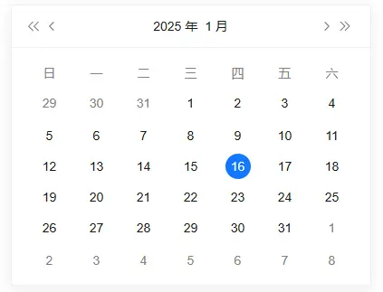
1、日期面板(TinyDatePanel)
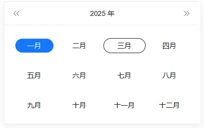
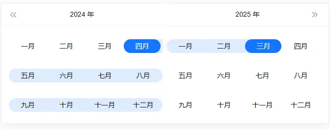
2、月份面板(TinyDatePanel:type=month)
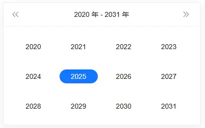
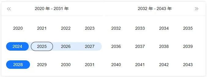
3、年份面板(TinyDatePanel:type=year)
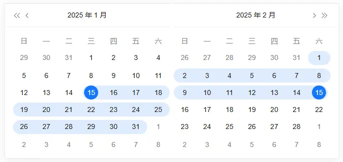
4、日期區間面板(TinyDateRange:type=daterange)
5、月份區間面板(TinyMonthRange)
6、年份區間面板(TinyYearRange)
亮點特性介紹
1、靈活的面板類型
DatePicker 面板組件支持多種面板類型,滿足不同場景的需求:
- 日期選擇:默認的日期選擇面板,支持單選和範圍選擇。
- 日期區間選擇:單獨的日期區間選擇面板,適合需要時間區間的場景。
2、自定義樣式
DatePicker 面板組件提供了豐富的樣式配置選項,您可以根據項目需求自定義面板的外觀:
- 主題顏色:支持自定義主題顏色,與您的項目風格完美融合。
- 佈局調整:可以調整面板的佈局,例如調整日期格子的大小、排列方式等。
3、便捷的事件處理
DatePicker 面板組件提供了對應的事件回調,方便您在不同場景下處理用户操作:
- SelectChange:當用户選擇日期或時間時觸發,返回選中的日期
如何二次拓展
DatePicker 組件不僅功能強大,還支持二次擴展,滿足複雜業務場景的需求。
1. 自定義快捷選項
您可以根據需求自定義快捷選項。例如,在日期面板中添加額外的快捷選中日期按鈕:
<template>
  <div class="demo-date-panel-wrap">
    <div class="value">{{ value }}</div>
    <tiny-date-panel v-model="value" :shortcuts="shortcuts"></tiny-date-panel>
  </div>
</template>
<script setup>
import { ref } from'vue'
import { TinyDatePanel } from'@opentiny/vue'

const value = ref('2025-01-15')
const shortcuts = [
  {
    text: '今天',
    onClick(picker) {
      const date = newDate()
      picker.$emit('pick', date)
    }
  },
  {
    text: '昨天',
    onClick(picker) {
      const date = newDate()
      date.setTime(date.getTime() - 3600 * 1000 * 24)
      picker.$emit('pick', date)
    }
  },
  {
    text: '一週前',
    onClick(picker) {
      const date = newDate()
      date.setTime(date.getTime() - 3600 * 1000 * 24 * 7)
      picker.$emit('pick', date)
    }
  }
]
</script>
2、與其他組件靈活混合使用,例如和popper組件混合使用
<template>
   <tiny-popover placement="top-start">
      <template #reference>
          <tiny-button>點我展示面板</tiny-button>
      </template>
      <template #default>
          <div class="value">{{ value }</div>
          <tiny-date-panel v-model="value"></tiny-date-panel>
      </template>
   </tiny-popover>
</template>

<script setup>
import { ref } from 'vue'
import { TinyPopover, TinyButton, TinyDatePanel } from *@opentiny/vue'

const value = ref('2025-01-15')
</script>
效果如下:

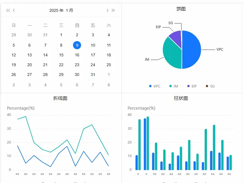
2.1 和chart組件混合使用
<template>
  <div class="demo-date-panel-wrap">
      <div style="display: flex; width: 1oepx; justify-content: baseline">
          <div style="">
              <tiny-date-panel v-model="value" @select-change="handleSelectChange"></tiny-date-panel>
          </div>
          <div style="width: 420px; border: solid 1px #fofofo">
              <h3class="title">餅圖</h3>
                  <br />
                  <div class="content">
                      <tiny-chart :key="key" type="ring" :options="options3" :width="420" height="270px"></tiny-chart>
                  </div>
          </div>
      </div>
      <div style="display: flex; width: 1ooopx; justify-content: baseline">
          <div style="width: 420px; border: solid 1px #fofofo">
              <h3 class="title">折線圖</h3>
              <div class="content">
                  <tiny-chart type="line" :width="420" height="311px" :options="options1"></tiny-chart>
              </div>
          </div>
          <div style="width: 420px; border: solid 1px #f0f0fe">
              <h3 class="title">柱狀圖</h3>
              <div class="content">
                  <tiny-chart type="histogram" :width="420" height="311px" :options="options2"></tiny-chart>
              </div>
          </div>
      </div>
  </div>
</template>
<script setup lang="jsx">
import { ref } from'vue'
import { TinyHuichartsasTinyChart } from'@opentiny/vue-huicharts'
import { TinyDatePanel  } from'@opentiny/vue'

const value = ref('2025-01-15')
const options1 = ref({
padding: [50, 30, 50, 20],
legend: {
    show: true,
    icon: 'line'
  },
data: [
    { Month: 'Jan', Domestics: 33, Abroad: 37 },
    { Month: 'Feb', Domestics: 27, Abroad: 39 },
    { Month: 'Mar', Domestics: 31, Abroad: 20 },
    { Month: 'Apr', Domestics: 30, Abroad: 15 },
    { Month: 'May', Domestics: 37, Abroad: 13 },
    { Month: 'Jun', Domestics: 36, Abroad: 17 },
    { Month: 'Jul', Domestics: 42, Abroad: 22 },
    { Month: 'Aug', Domestics: 22, Abroad: 12 },
    { Month: 'Sep', Domestics: 17, Abroad: 30 },
    { Month: 'Oct', Domestics: 40, Abroad: 33 },
    { Month: 'Nov', Domestics: 42, Abroad: 22 },
    { Month: 'Dec', Domestics: 32, Abroad: 11 }
  ],
xAxis: {
    data: 'Month'
  },
yAxis: {
    name: 'Percentage(%)'
  }
})

const options2 = ref({
padding: [50, 30, 50, 20],
legend: {
    show: true,
    icon: 'line'
  },
data: [
    { Month: 'Jan', Domestics: 33, Abroad: 37 },
    { Month: 'Feb', Domestics: 27, Abroad: 39 },
    { Month: 'Mar', Domestics: 31, Abroad: 20 },
    { Month: 'Apr', Domestics: 30, Abroad: 15 },
    { Month: 'May', Domestics: 37, Abroad: 13 },
    { Month: 'Jun', Domestics: 36, Abroad: 17 },
    { Month: 'Jul', Domestics: 42, Abroad: 22 },
    { Month: 'Aug', Domestics: 22, Abroad: 12 },
    { Month: 'Sep', Domestics: 17, Abroad: 30 },
    { Month: 'Oct', Domestics: 40, Abroad: 33 },
    { Month: 'Nov', Domestics: 42, Abroad: 22 },
    { Month: 'Dec', Domestics: 32, Abroad: 11 }
  ],
xAxis: {
    data: 'Month'
  },
yAxis: {
    name: 'Percentage(%)'
  }
})

const options3 = ref({
type: 'pie',
data: [
    { value: 100, name: 'VPC' },
    { value: 90, name: 'IM' },
    { value: 49, name: 'EIP' },
    { value: 14, name: 'SG' }
  ]
})

consthandleSelectChange = () => {
  options1.value.data = options1.value.data.map((item) => {
      item.Domestics = item.Domestics * (Math.random() * 0.9 + 0.1)
      return item
  })
  options2.value.data = options2.value.data.map((item) => {
      item.Domestics = item.Domestics * (Math.random() * 0.9 + 0.1)
      return item
  })
  options3.value.data = options3.value.data.map(item) => {
      item.value = item.value * (Math.random() * 0.9 + 0.1)
      return item
  })
}
</script>
效果如下:
更多場景期待您的探索和發掘
總結
DatePicker 面板組件支持日期面板單獨使用,為開發者提供了更大的靈活性和可定製性。無論是基礎的日期選擇功能,還是複雜的業務場景,DatePicker 面板組件都能滿足您的需求。快來體驗這個組件吧!
關於OpenTiny
歡迎加入 OpenTiny 開源社區。添加微信小助手:opentiny-official 一起參與交流前端技術~
OpenTiny 官網:https://opentiny.design/
OpenTiny 代碼倉庫:https://github.com/opentiny/
TinyVue 源碼:https://github.com/opentiny/tiny-vue
TinyEngine 源碼: https://github.com/opentiny/tiny-engine
歡迎進入代碼倉庫 Star🌟TinyEngine、TinyVue、TinyNG、TinyCLI~ 如果你也想要共建,可以進入代碼倉庫,找到 good first issue標籤,一起參與開源貢獻~

