


利用grid佈局可以高效地實現二維佈局。但是其眾多的屬性以及屬性值,讓很多剛剛接觸的人和沒有系統性總結的人云裏霧裏,這增加了使用grid的成本。
為此,從實用角度出發,按照類別,系統性地總結了日常開發常用的知識點。
網格容器屬性
聲明元素為網格佈局
通過 display: grid 聲明某個元素為網格佈局:
.wrapper {
  /* 聲明一個容器 */
  display: grid;
  /*  聲明列的寬度  */
  grid-template-columns: repeat(3, 200px);
  /*  聲明行間距和列間距  */
  gap: 20px;
  /*  聲明行的高度  */
  grid-template-rows: 100px 200px;
}
grid-template-columns / grid-template-rows
grid-template-columns定義網格中 列 的寬度。grid-template-rows定義網格中 行 的寬度。
下面以 grid-template-columns 做説明(grid-template-rows 的用法與之類似,就不必重複説明了)
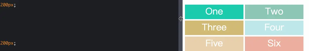
固定寬度
.wrapper {
  display: grid;
  /*  聲明瞭三列,寬度分別為 200px 100px 200px */
  grid-template-columns: 200px 100px 200px;
  gap: 5px;
  /*  聲明瞭兩行,行高分別為 50px 50px  */
  grid-template-rows: 50px 50px;
}
repeat() 函數
簡化重複的值。
語法:repeat(repeat_number, length)。
.wrapper {
  display: grid;
  grid-template-columns: 200px 100px 200px;
  gap: 5px;
  /*  2行,而且行高都為 50px  */
  grid-template-rows: repeat(2, 50px);
}
auto-fill 關鍵字
表示自動填充,讓一行(或者一列)中儘可能的容納更多的單元格。
grid-template-columns: repeat(auto-fill, 200px) 表示列寬是 200 px,但列的數量是不固定的,只要瀏覽器能夠容納得下,就可以放置元素,代碼以及效果如下圖所示:
.wrapper {
  display: grid;
  grid-template-columns: repeat(auto-fill, 200px);
  gap: 5px;
  grid-auto-rows: 50px;
}
fr 關鍵字
fr 單位代表網格容器中可用空間的一個等份。grid-template-columns: 200px 1fr 2fr 表示第一個列寬設置為 200px,後面剩餘的寬度分為兩部分,寬度分別為剩餘寬度的 1/3 和 2/3。代碼以及效果如下圖所示:
.wrapper {
  display: grid;
  grid-template-columns: 200px 1fr 2fr;
  gap: 5px;
  grid-auto-rows: 50px;
}
minmax() 函數
minmax() 函數產生一個長度範圍,表示長度就在這個範圍之中都可以應用到網格項目中。它接受兩個參數,分別為最小值和最大值。grid-template-columns: 1fr 1fr minmax(300px, 2fr) 的意思是,第三個列寬最少也是要 300px,但是最大不能大於第一第二列寬的兩倍。代碼以及效果如下:
語法:minmax(min_length, max_length)。
.wrapper {
  display: grid;
  grid-template-columns: 1fr 1fr minmax(300px, 2fr);
  gap: 5px;
  grid-auto-rows: 50px;
}
auto 關鍵字
由瀏覽器決定長度。通過 auto 關鍵字,可以輕易實現三列或者兩列布局。grid-template-columns: 100px auto 100px 表示第一第三列為 100px,中間由瀏覽器決定長度,代碼以及效果如下:
.wrapper {
  display: grid;
  grid-template-columns: 100px auto 100px;
  gap: 5px;
  grid-auto-rows: 50px;
}
gap / column-gap / row-gap
row-gap 屬性設置行間距。
column-gap 屬性設置列間距。
gap 屬性是上面兩者的簡寫形式:row-gap column-gap。
.wrapper {
  display: grid;
  grid-template-columns: 200px 100px 100px;
  gap: 10px 20px;
  grid-auto-rows: 50px;
}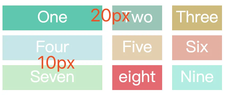
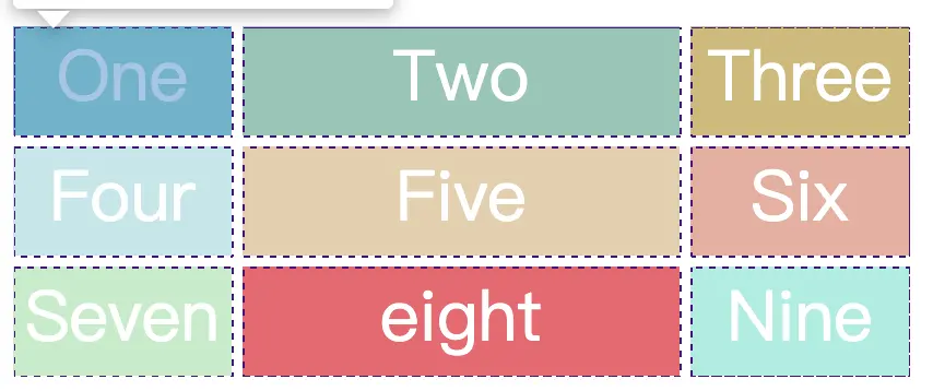
grid-auto-flow
默認的放置順序是“先行後列“:先填滿第一行,再開始放入第二行,即下圖英文數字的順序 one,two,three...。這個順序由 grid-auto-flow 屬性決定。
語法:
grid-auto-flow: row;            // 先行後列(默認值)
grid-auto-flow: column;         // 先列後行
grid-auto-flow: row dense;      // 先行後列,儘可能填滿表格
grid-auto-flow: column dense;   // 先列後行,儘可能填滿表格
grid-auto-flow: row:

為了儘可能填滿表格,使用 grid-auto-flow: row dense 可以填充上圖中 Three 和 Seven 之間的空白。效果如下所示:

.wrapper {
display: grid;
grid-template-columns: 100px 200px 100px;
grid-auto-flow: row;
/* grid-auto-flow: row dense; */
gap: 5px;
grid-auto-rows: 50px;
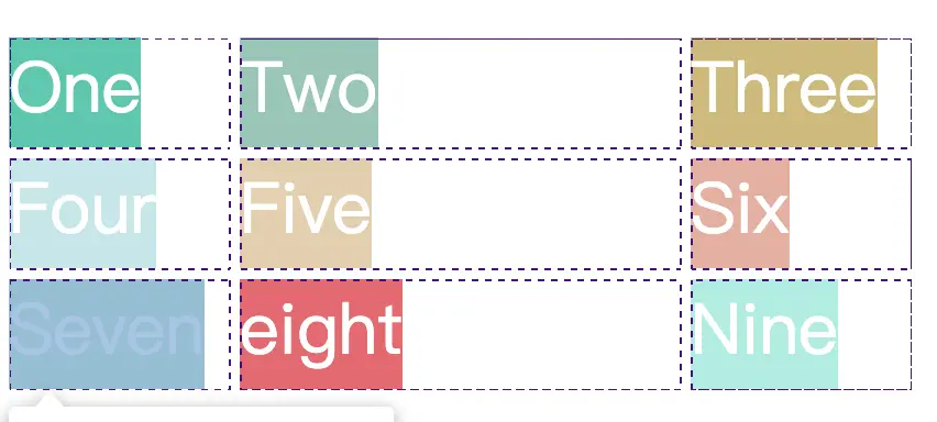
}justify-items / align-items / place-items
justify-items 設置網格佈局中,所有單元格內容的水平位置(左中右)。
align-items 設置網格佈局中,所有單元格內容的垂直位置(上中下)。
place-items 屬性是上面兩者的簡寫形式:align-items justify-items。
下面以 justify-items 做説明(align-items 的用法與之類似,就不必重複説明了)
語法:
justify-items: start;     // 單元格的起始邊緣(水平 - 左邊 / 垂直 - 上邊)
justify-items: center;    // 單元格內部居中
justify-items: end;       // 單元格的結束邊緣(水平 - 右邊 / 垂直 - 下邊)
justify-items: stretch;   // 默認值。佔滿單元格的某一維度的全部空間(水平 or 垂直)
justify-items: start - 單元格的起始邊緣(水平 - 左邊 / 垂直 - 上邊):
justify-items: end - 單元格內部居中:

justify-items: center - 單元格的結束邊緣(水平 - 右邊 / 垂直 - 下邊):
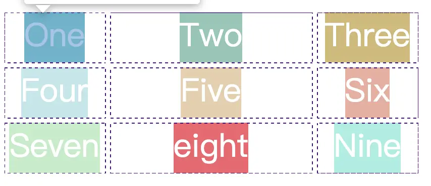
justify-items: stretch - 默認值。佔滿單元格的某一維度的全部空間(水平 or 垂直):
.wrapper {
  display: grid;
  grid-template-columns: 100px 200px 100px;
  gap: 5px;
  grid-auto-rows: 50px;
  justify-items: start;
}
grid-auto-columns / grid-auto-rows
grid-template-columns 和 grid-template-rows 這兩個屬性構成了網格容器的行數和列數。
如果實際的單元格數量,超過了由 grid-template-columns 和 grid-template-rows 構成的單元格數量,那麼這些額外單元格的行高、列寬如何約定呢?

這就需要由 grid-auto-columns / grid-auto-rows 來確定了:
grid-auto-columns確定額外單元格的列寬(默認值為 auto,自動適配內容的最大寬度)grid-auto-rows確定額外單元格的行高(默認值為 auto,自動適配內容的最大寬度)
當 grid-auto-flow 為 row 時,單元格按照 先行後列 順序填充網格:額外單元格 的列寬 由 grid-template-columns 確定;行高 就由 grid-auto-rows 確定。
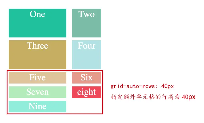
.wrapper {
  margin: 50px;
  display: grid;
  grid-template-columns: 200px 100px;
  /*  只設置了兩行,但實際的數量會超出兩行,超出的行高會以 grid-auto-rows 算 */
  grid-template-rows: 100px 100px;
  grid-gap: 10px 20px;
  grid-auto-rows: 40px;
}
當 grid-auto-flow 為 column 時,單元格按照 先列後行 順序填充網格:額外單元格 的 行高 由 grid-template-rows 確定;列寬 就由 grid-auto-columns 確定。
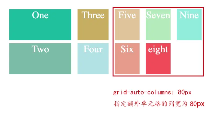
.wrapper {
  margin: 50px;
  display: grid;
  grid-template-columns: 200px 100px;
  grid-auto-flow: column;
  /*  只設置了兩列,但實際的數量會超出兩列,超出的列寬會以 grid-auto-columns 算 */
  grid-template-rows: 100px 100px;
  grid-gap: 10px 20px;
  grid-auto-columns: 80px;
}
網格項目屬性
grid-column-start / grid-column-end / grid-row-start / grid-row-end
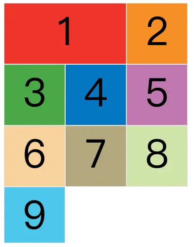
指定網格項目所在的四個邊框,分別定位在哪根網格線,從而指定項目的位置。網格線的序號:
- 從左到右,由 1 開始依次遞增。
- 從上到下,由 1 開始依次遞增。
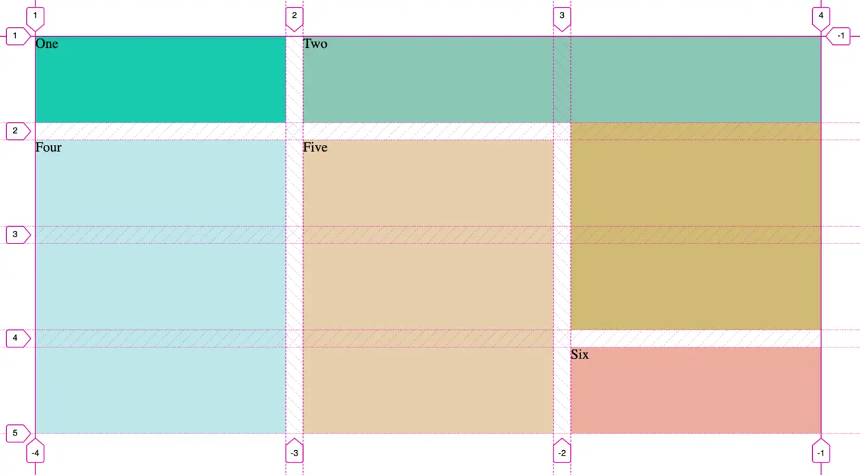
grid-column-start屬性:網格項目左邊框所在的垂直網格線grid-column-end屬性:網格項目右邊框所在的垂直網格線grid-row-start屬性:網格項目上邊框所在的水平網格線grid-row-end屬性:網格項目下邊框所在的水平網格線
上圖Five的樣式:
.wrapper {
  display: grid;
  grid-template-columns: repeat(3, 1fr);
  gap: 20px;
  grid-auto-rows: minmax(100px, auto);
}

.five {
  grid-column-start: 2;
  grid-column-end: 3;
  grid-row-start: 2;
  grid-row-end: 5;
  background: #e6ceac;
}
span 關鍵字
上述四個屬性的值還可以使用 span 關鍵字,表示"跨越",即左右邊框(上下邊框)之間跨越多少個網格。
.item-1 {
  grid-column-start: span 2;
}
上面代碼表示,1 號項目的左邊框距離右邊框跨越 2 個網格。
justify-self / align-self / place-self
justify-self / align-self / place-self 與 justify-items / align-items / place-items 屬性的用法是一樣的,只是 justify-self / align-self / place-self 作用於單個網格項目。
grid-template-areas / grid-area
網格容器屬性 grid-template-areas 在網格容器中定義具有語義化的區域,一個區域由一個或者多個單元格組成。
網格項目屬性 grid-area 指定項目放在網格容器的哪一個區域。
例如下面的代碼:
網格容器劃分出 6 個單元格,其中值得注意的是 . 符號代表空的單元格,也就是沒有用到該單元格。
樣式類 .sidebar .content .header 所在的元素放在上面 grid-template-areas 中定義的 sidebar content header 區域中
.wrapper {
  display: grid;
  grid-gap: 10px;
  grid-template-columns: 120px 120px 120px;
  grid-template-areas:
    '. header  header'
    'sidebar content content';
  background-color: #fff;
  color: #444;
}

.sidebar {
  grid-area: sidebar;
}

.content {
  grid-area: content;
}

.header {
  grid-area: header;
}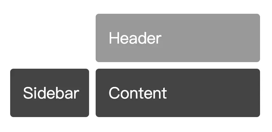
將網格項目指定到某個區域,不會隨着添加/刪除網格項目,而導致其位置發生改變。
日常使用注意事項
align-items默認值是stretch,會導致每個單元格 dom 元素的高度被撐滿,不是 dom 元素原本的高度。為了使單元格 dom 元素的高度還原為實際的高度,建議在使用grid時,先進行如下的初始化:
.wrapper {
  display: grid;
  align-items: start;
}
參考
最強大的 CSS 佈局 —— Grid 佈局