
CSS學習筆記
1.嵌入方式
1)css嵌入到html的頭部的style標籤內
<div style="background-color:lightcoral; color: #fff; width: 300px;">
    hello world
  </div>
2)css嵌入到元素style屬性內
優點:css規則與HTML分離;可以複用
<style>
    #one, #two{
      background-color:lightcoral;
      color: #fff;
      width: 300px;
      margin-bottom: 1em;
    }
  </style>
3)單獨寫到.css文件,並通過link引入
.box {
  background-color:lightcoral;
  color: #fff;
  width: 300px;
  margin-bottom: 1em;
}

#one {
  height: 100px;
}
2.語法
註釋:/*註釋內容*/語法:
  選擇器{
          樣式規則
   }
3.選擇器
1)核心選擇器
- id選擇器 唯一
#one{} - class選擇器 非唯一
.box{} - 標籤選擇器
div{} - 並且選擇器(非官方)
div.box{} 選中div元素,並且這個div的class是box
tip:子元素一般繼承父元素的字體字號屬性 - 和選擇器(重置樣式規則)
div,.box{} 選中div元素和class未box的元素 -
普遍選擇器(慎用)
*{} 選中所有元素2)層次選擇器(兩個選擇器配合使用)
子選擇器:通過父元素選擇子元素
- 大於號
後代選擇器:
- 空格
ul.menu > li.menu_item {
      float: left;
      line-height: 3em;
      width: 100px;
      text-align: center;
      position: relative;
      cursor: pointer;
    }
    ul.menu > li.menu_item:hover ul.sub_menu {
      display: block;
    }
    /* 二級菜單容器 */
    /* 後代選擇器 */
    ul.menu ul.sub_menu {
      display: none;
      position: absolute;
      color: #666;
    }
    /* 二級菜單元素 */
    ul.menu ul.sub_menu > li {

    }
<div class="second_line">
<div class="logo">logo</div>
<!-- ul 菜單列表 -->
<ul class="menu">
<li class="menu_item">
<span>學校概況</span>
<ul class="sub_menu">
<li>學校簡介</li>
<li>歷史沿革</li>
</ul>
</li>
<li class="menu_item">
<span>人才培養</span>
<ul class="sub_menu">
<li>本科生教育</li>
<li>研究生教育</li>
</ul>
</li>
<li class="menu_item">
<span>科學研究</span>
</li>
</ul>
</div>兄弟選擇器:
- ~ 當前元素之後的所有兄弟
- +當前元素之後的下一個兄弟
ul.rank {
      margin: 0;
      padding: 0;
      list-style: none;
    }
    ul.rank > li:nth-child(2) + *{
      color: tomato;
    }
    ul.rank > li:nth-child(3) ~ *{
      color: rgb(241, 28, 170);
    }
3)屬性選擇器(屬性過濾器),一般應用於表單元素
input[name]
具有name屬性input元素input[name='username']
具有name屬性,並且name屬性值為username的input元素input[name^='u']
具有name屬性,並且name屬性值以'u'作為開始input[name*='u']
具有name屬性,並且name屬性值包含'u'input[name$='u']
具有name屬性,並且name屬性值以'u'作為結尾4)偽類選擇器(偽類過濾器)
:first-child
:last-child
:nth-child(n) 第n個孩子節點
:visited 訪問過的
:hover 光標懸浮
:active a標籤的激活狀態
:focus 聚焦(多個輸入框,光標選中)
5)偽元素選擇器
::after
li 標籤浮動之後,ul標籤失去支撐,需要增加偽元素支撐
<style>
    ul {
      list-style: none;
    }
    ul.menu {
      background-color: tomato;
    }
    ul.menu > li{
      float: left;
    }
    ul.menu::after {
      content: "11";
      display: block;
      clear: both;
    }
  </style>
<ul class="menu">
<li>one</li>
<li>two</li>
</ul>tip:計算選擇器優先級(多個選擇器的相同規則作用於同一元素)
1)權重
 1000 style
 100  id
 10   class、偽類
 1    元素選擇器、偽元素
2)順序
  當權重值相同時,後者覆蓋前者
3)特權(!important)
  脱離權重和順序規則
4.樣式規則
1)字體規則
可被繼承
- font-family:字體、字體棧
在瀏覽器所在pc從字體棧頂到底尋找字體,找不到使用默認字體
font-family:"Microsoft YaHei","微軟雅黑",sana-serif;- font-size: 字體大小 12px
- font-weight: 字體粗細程度 100~900 bold bolder
- font-style: normal italic(斜體)
- color: 字體顏色
-
line-height: 行高 用於文本垂直居中 3em(相對單位)
長度單位:px:像素
em:為當前元素字號的n倍
rem:為根元素字號的n倍
font(速寫):font-style font-weight font-size/line-height font-family屬性的簡寫
font:normal bold 24px/1 sans-serif
網絡字體
阿里巴巴矢量圖標庫:https://www.iconfont.cn/colle...
1.選擇單色圖標(多色圖標只能通過下載方式上傳)
2.加入購物車後,來到如圖所示頁面
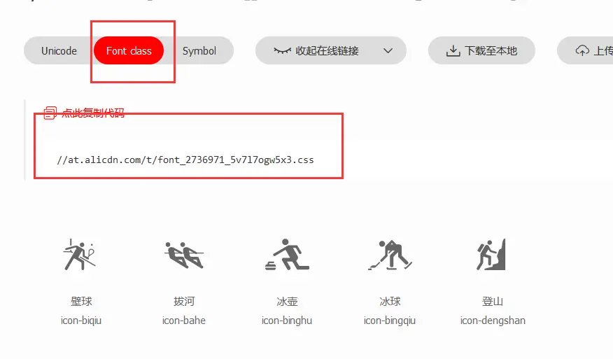
查看網址中的代碼,如下所示:
@font-face {
  font-family: "iconfont"; /* Project id 2736919 */
  src: url('//at.alicdn.com/t/font_2736919_pbwmmlyvs57.woff2?t=1628652186798') format('woff2'),
       url('//at.alicdn.com/t/font_2736919_pbwmmlyvs57.woff?t=1628652186798') format('woff'),
       url('//at.alicdn.com/t/font_2736919_pbwmmlyvs57.ttf?t=1628652186798') format('truetype');
}

.iconfont {
  font-family: "iconfont" !important;
  font-size: 16px;
  font-style: normal;
  -webkit-font-smoothing: antialiased;
  -moz-osx-font-smoothing: grayscale;
}

.icon-fuwufankui:before {
  content: "\e67d";
}

.icon-Backward-Button:before {
  content: "\e82e";
}

.icon-Back-button:before {
  content: "\e82f";
}

.icon-Airplane-2:before {
  content: "\e830";
}
在自己代碼中加入如下代碼:
<!-- 1. 引入iconfont的css文件 -->
  <link rel="stylesheet" href="http://at.alicdn.com/t/font_2736919_pbwmmlyvs57.css">
<!-- 2調用 -->
<div class="content">
<i class="iconfont icon-Backward-Button"></i>
<span class="iconfont icon-Airplane-2"></span>
<em class="iconfont icon-duanxin"></em>
</div>2)文本規則
- text-align:left/right/center
- text-decoration:none(取消原有下劃線) overline/underline/line-through(橫線在中間)
- text-indent:縮進
- text-transform:控制大小寫(capitalize/uppercase/lowercase/none)
- text-shadow:陰影(x軸,y軸,暈染範圍,顏色)
- vertical-align:行內元素在容器中的垂直排列方式 (display:inline-block)
- text-overflow:文本超出部分如何顯示提示(ellipsis ...)
- white-space:處理元素中的空白(nowrap 不換行)
-
overflow:容器內容超出部分如何處理(visible/hidden/scroll/auto)
overflow注意事項:容器的內容大小超過容器本身
在父元素中加 overflow:hidden;
父元素中加 overflow-x:hidden; overflow-y:scroll;(橫向隱藏,縱向滾動)
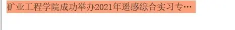
.box {
      width: 300px;
      background-color: lightsalmon;

      white-space: nowrap;
      overflow: hidden;
      text-overflow: ellipsis;
    }
<div class="box">
礦業工程學院成功舉辦2021年遙感綜合實習專家報告會
</div>效果展示:
3)列表規則
用於設置有序列表、無序列表、自定義列表的顯示方式(ul\ol\dl)
list-style:none;
4)其他規則
-
cursor:光標懸浮到連接上時光標的形狀
cursor:pointer;小手
cursor:crosshair;十字
cursor:wait;
cursor:help;問號 - visibility:設置內容顯示與隱藏(不顯示,佔空間)
hidden/visible - display:none;(不顯示,不佔據空間)
block(行內元素轉為塊元素)
inline(塊元素轉為行內元素)
inline-block(行內塊元素:與其他行內元素共享一行空間and可以指定寬高) - opacity:設置透明度,0-1間取值,取值為0的時候隱藏,佔據屏幕空間
- overflow:盒子內部內容溢出部分處理
visible/hidden/scroll/auto -
outline:設置外邊框
outline:none;
outline-width:; 寬度
outline-style:solid; 外邊框樣式
outline-color:; 外邊框顏色
outline-offset:; 偏移量
面試題:
1.文本在盒子中水平居中?
  text-align:center
2.文本在盒子中垂直居中?
  1) line-height 行高
  2) vertical-align 行內元素?
3.盒子在容器中水平居中?(盒子應該位於容器內部,容器通常情況下要比盒子大)
  1) margin: 0 auto;
  2) 定位 margin-left:50%; (此時左側邊框位於中線)left:-50px; position :relative;
  3)相對定位+絕對定位
4.盒子在容器中垂直居中?
  1) 父元素padding, box-sizing:border-box
  2) 父元素padding + 子元素margin, box-sizing:border-box
  3)伸縮盒佈局 父元素屬性:align-items(交叉軸)/justify-content(主軸)(看具體是主軸還是交叉軸)
vertical-align垂直居中案例:
 .box {
      background-color:cornflowerblue;
      color: #fff;
      height: 100px;
      text-align: center;
    }

    .box::after {
      content: "";
      display: inline-block;
      height: 100px;
      vertical-align: middle;
    }

    <div class="box">
       hello world
    </div>
5)盒子規則
-
margin 外邊距(盒子外邊框距離其他元素的距離)
margin: 10px; 上右下左
margin: 10px 20px; 上下,左右
margin: 10px 20px 30px; 上 左右 下
margin: 10px 20px 30px 40px; 下 右 下 左
速寫形式,外邊距,上下外邊距會進行重疊
margin-top
margin-right
margin-bottom
margin-left -
border
border-width border-top-width border-right-width border-bottom-width border-left-width border-style border-top-style border-right-style border-bottom-style border-left-style border-color border-top-color border-right-color border-bottom-color border-left-color border 速寫 border: 2px solid #ccc; -
padding 內邊距 (內容距離盒子內邊框的距離)
padding: 10px; 上右下左
padding: 10px 20px; 上下,左右
padding: 10px 20px 30px; 上 左右 下
padding: 10px 20px 30px 40px; 下 右 下 左
速寫形式,外邊距,上下外邊距會進行重疊
padding-top
padding-right
padding-bottom
padding-left - width/height
-
background
background-color
background-image:url()
background-repeat
background-size(contain包含、cover覆蓋、百分比)
background-positon
background-clip
background-orign
background-attachment
background(速寫)border: 10px dashed #ccc; background-image: url('./images/carousel2.jpg'); background-repeat: no-repeat; background-clip: border-box;/*邊框仍然有圖*/ background-origin: content-box;/*起源點從哪裏開始*/ - border-radius:圓角半徑(常用於畫⚪)
-
box-sizing(盒子模式)
1.內容盒子(普通盒子,默認盒子)
content-box;
盒子實際佔據的寬度: 2borderWidth + 2padding + width
盒子實際佔據的高度: 2borderHeight + 2padding + height
2.邊框盒子(怪異盒子)————應用實例:呼吸燈
border-box;
盒子實際佔據寬度:width
width=2borderWidth+2padding+內容寬
盒子實際佔據高度:height
/*呼吸燈實例*/
<style>
    .outer , .inner {
      box-sizing: border-box; /* width : padding + border + 內容*/
      border-radius: 50%;/*變成圓形*/
    }
    .outer {
      width: 300px;
      height: 300px;
      border: 3px solid #ccc;
      margin: 0 auto;
      padding: 50px;
      /* 漸變 */
      transition: padding 2s;
    }
    .outer:hover {
      padding: 10px;
    }
    .outer .inner {
      width: 100%;
      height: 100%;
      border: 5px solid #ccc;
    }
  </style>
<div class="outer">
<div class="inner">
</div>
</div>5.佈局
1)默認文檔流 (y軸)
塊元素, 獨佔一行空間,高度由內容決定。塊元素默認從上往下排列
2)浮動佈局(x軸)
-
float
浮動元素: 1) 脱離文檔流 2) 塊元素的寬度不再是100%,由內容決定 3) 塊元素不再支撐其父元素 4) 同一層次(兄弟關係)浮動元素會在一行排列,當浮動元素寬度總和大於父元素的時候會發生換行。 -
clear
清理浮動
  left  不與左浮動元素在同一水平線上
  right 不與右浮動元素在同一水平線上
3)伸縮盒佈局(x軸、y軸)
div.container>div
ul.container>li
1)概念
伸縮盒容器 div.container 、ul.container
伸縮盒元素 div、li
主軸    默認主軸x軸,伸縮盒中,伸縮盒子元素沿着主軸來進行排列
交叉軸  與主軸垂直的軸
2)規則
伸縮盒容器
display:flex;
強制讓它的子元素沿着主軸方向中顯示,並且子元素不會脱離文檔流,交叉軸上元素的高度如果沒有指定,應該和父元素保持一致。
flex-direction:row;
定義主軸方向,row 表示主軸是x軸,column表示主軸為y軸
flex-wrap:nowrap;
當子元素的長度加起來超過主軸上的父元素的寬度,默認不換行,wrap為換行
align-items: stretch;(拉伸)
定義伸縮盒容器中的子元素在交叉軸上的排列方式
justify-content:space-around;
定義伸縮盒容器中的子元素在主軸上的排列方式
伸縮盒元素
flex-basic: 主軸上的基礎長度(基本工資)
flex-grow: 主軸上剩餘空間分配的份數(分紅)
flex-shrink: 主軸上虧損空間的分攤份數(虧損)

4)定位佈局(z軸)
(1)position:
- static 靜態(默認、非定位元素)
- relative 相對(定位元素)
- absolute 絕對(定位元素)
- fixed 固定(定位元素)
- sticky 粘滯(定位元素)
定位元素的特點: 可以使用定位規則。top right bottom left
1) 相對定位
- 不脱離文檔流
- 相對於它原來所在位置移動
2) 絕對定位
- 脱離文檔流
- 相對於距離它最近的父定位元素位置移動!如果所有的父元素都不是定位元素,相對於瀏覽器視口位置移動
- 一般情況下,絕對定位元素應該嵌套在相對定位元素內容來使用
3) 固定定位
- 脱離文檔流
- 相對於瀏覽器視口進行定位
4) 粘滯定位
- 在沒有達到閾值的時候是不脱離文檔流(相對),達到閾值脱離文檔流(固定)
- 通過left、top、right、bottom來設定閾值
(2)定位佈局的應用:
- 二級欄目
- 模態框
- 特殊佈局