


創建項目
pnpm create vite直接使用模板創建
pnpm create vite my-vue-app --template vue安裝 JSX 支持依賴
cd my-vue-app
npm install @vitejs/plugin-vue-jsx -D
配置 vite.config.js
import { defineConfig } from 'vite'
import vue from '@vitejs/plugin-vue'
import vueJsx from '@vitejs/plugin-vue-jsx'

export default defineConfig({
  plugins: [
    vue(),
    vueJsx()
  ]
})
Vue 中使用 JSX
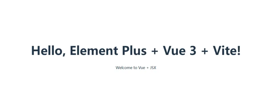
export default function Hello(props) {
  return (
    <div class="hello">
      <h1>Hello, {props.name}!</h1>
      <p>Welcome to Vue + JSX</p>
    </div>
  )
}
在 Vue 組件中使用
<!-- App.vue -->
<template>
  <div>
    <Hello :name="userName" />
    <button @click="updateName">更新名稱</button>
  </div>
</template>

<script setup>
import { ref } from 'vue'
import Hello from './components/Hello.jsx'

const userName = ref('World')

const updateName = () => {
  userName.value = 'Vue JSX'
}
</script>
顯示效果
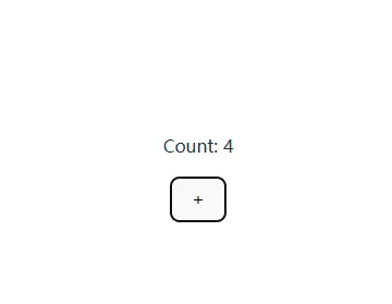
純 JSX Vue 組件
// components/Counter.jsx
import { ref } from 'vue'

export default {
  setup() {
    const count = ref(0)

    const increment = () => {
      count.value++
    }

    return () => (
      <div class="counter">
        <p>Count: {count.value}</p>
        <button onClick={increment}>+</button>
      </div>
    )
  }
}
JSX 在 Vue 中的特性
// Parent.jsx
export default {
  setup(props, { slots }) {
    return () => (
      <div class="parent">
        <h2>父組件</h2>
        {slots.default?.()}
        {slots.header?.()}
      </div>
    )
  }
}

// Child.jsx
import Parent from './Parent.jsx'

export default {
  setup() {
    return () => (
      <Parent>
        {{
          default: () => <p>默認插槽內容</p>,
          header: () => <h3>頭部插槽</h3>
        }}
      </Parent>
    )
  }
}
jsx 事件處理
export default {
  setup(props, { emit }) {
    const handleClick = (event) => {
      emit('custom-event', { data: 'from jsx' })
    }

    return () => (
      <div>
        <button onClick={handleClick}>點擊我</button>
      </div>
    )
  }
}
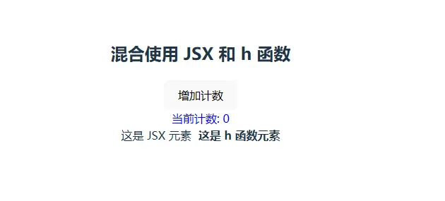
JSX 與 h 函數混合使用
import { ref, h } from 'vue'

export default {
  setup() {
    const count = ref(0)

    // 使用 h 函數創建複雜的動態元素
    const renderDynamicElement = () => {
      return h('div', {
        class: 'dynamic-element',
        style: { color: count.value > 5 ? 'red' : 'blue' }
      }, `當前計數: ${count.value}`)
    }

    const increment = () => {
      count.value++
    }

    return () => (
      <div class="mixed-component">
        <h2>混合使用 JSX 和 h 函數</h2>
        <button onClick={increment}>增加計數</button>

        {renderDynamicElement()}

        <div class="container">
          <span>這是 JSX 元素</span>
          {h('strong', { style: { marginLeft: '10px' } }, '這是 h 函數元素')}
        </div>
      </div>
    )
  }
}
jsx 條件渲染 h 和 jsx 混合使用
import { ref, h } from 'vue'

export default {
  props: {
    showList: Boolean
  },

  setup(props) {
    const items = ref(['Item 1', 'Item 2', 'Item 3'])

    // 使用 h 函數渲染列表
    const renderList = () => {
      return h('ul', { class: 'item-list' },
        items.value.map((item, index) =>
          h('li', { key: index }, item)
        )
      )
    }

    return () => (
      <div class="conditional-mixed">
        <h3>條件混合渲染</h3>

        {/* JSX 條件渲染 */}
        {props.showList ? (
          <div>
            {/* 混合 h 函數 */}
            {renderList()}
            <button onClick={() => items.value.push(`Item ${items.value.length + 1}`)}>
              添加項目
            </button>
          </div>
        ) : (
          h('p', { class: 'empty-message' }, '列表為空')
        )}
      </div>
    )
  }
}

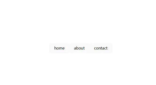
jsx 動態渲染組件
// components/DynamicRenderer.jsx
import { ref, h, resolveComponent } from 'vue'

export default {
  setup() {
    const currentView = ref('home')

    // 使用 h 函數動態解析組件
    const renderDynamicComponent = () => {
      const Component = resolveComponent(currentView.value)
      if (Component) {
        return h(Component, {
          class: 'dynamic-component',
          onClick: () => console.log('組件被點擊')
        })
      }
      return h('div', '組件未找到')
    }

    return () => (
      <div class="dynamic-renderer">
        <div class="tabs">
          {['home', 'about', 'contact'].map(tab => (
            <button
              key={tab}
              class={{ active: currentView.value === tab }}
              onClick={() => currentView.value = tab}
            >
              {tab}
            </button>
          ))}
        </div>

        {/* 混合 h 函數的動態渲染 */}
        <div class="content">
          {renderDynamicComponent()}
        </div>
      </div>
    )
  }
}
jsx 插槽與 h 函數混合
// components/SlotMixed.jsx
import { h } from 'vue'

export default {
  setup(props, { slots }) {
    // 使用 h 函數創建具名插槽內容
    const renderHeader = () => {
      return h('header', { class: 'custom-header' }, [
        h('h1', '自定義頭部'),
        h('nav', [
          h('a', { href: '#' }, '首頁'),
          h('a', { href: '#' }, '關於')
        ])
      ])
    }

    return () => (
      <div class="slot-mixed">
        <h2>插槽混合使用示例</h2>

        {/* JSX 默認插槽 */}
        <div class="main-content">
          {slots.default?.() || <p>默認內容</p>}
        </div>

        {/* h 函數具名插槽 */}
        {slots.header?.() || renderHeader()}

        {/* h 函數創建的底部 */}
        {slots.footer?.() || h('footer', { class: 'custom-footer' }, '底部內容')}
      </div>
    )
  }
}
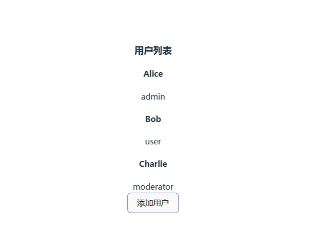
jsx/h 函數和<font style="color:rgb(228, 86, 73);background-color:rgb(250, 250, 250);">Fragment多個節點碎片使用
// components/UtilityMixed.jsx
import { ref, h, Fragment } from 'vue'

export default {
  setup() {
    const users = ref([
      { id: 1, name: 'Alice', role: 'admin' },
      { id: 2, name: 'Bob', role: 'user' },
      { id: 3, name: 'Charlie', role: 'moderator' }
    ])

    // 使用 h 函數創建工具函數
    const renderUserCard = (user) => {
      return h('div', {
        class: ['user-card', `role-${user.role}`],
        key: user.id
      }, [
        h('h4', user.name),
        h('span', { class: 'role-tag' }, user.role)
      ])
    }

    // 使用 Fragment 包裝多個元素
    const renderUserList = () => {
      return h(Fragment,
        users.value.map(user => renderUserCard(user))
      )
    }

    return () => (
      <div class="utility-mixed">
        <h3>用户列表</h3>

        {/* JSX 容器 */}
        <div class="user-container">
          {/* h 函數渲染的列表 */}
          {renderUserList()}
        </div>

        {/* 混合事件處理 */}
        <button
          onClick={() => {
            users.value.push({
              id: users.value.length + 1,
              name: `User ${users.value.length + 1}`,
              role: 'user'
            })
          }}
        >
          添加用户
        </button>
      </div>
    )
  }
}
element-plus 封裝按鈕組件
mybutton 組件
// components/MyButton.jsx
import { ElButton } from 'element-plus'

// 基礎按鈕封裝
export const MyButton = (props, { slots }) => {
  const {
    type = 'default',
    size = 'default',
    plain = false,
    round = false,
    circle = false,
    disabled = false,
    loading = false,
    icon = '',
    onClick = () => {},
    ...restProps
  } = props

  return (
    <ElButton
      type={type}
      size={size}
      plain={plain}
      round={round}
      circle={circle}
      disabled={disabled}
      loading={loading}
      icon={icon}
      onClick={onClick}
      {...restProps}>
      {slots.default?.()}
    </ElButton>
  )
}
🚀 增強版封裝
// components/MyButton.jsx
import { ElButton, ElTooltip } from 'element-plus'

/**
 * 自定義按鈕組件
 * @param {Object} props - 組件屬性
 * @param {string} props.type - 按鈕類型: primary/success/warning/danger/info/text
 * @param {string} props.size - 按鈕大小: large/default/small
 * @param {boolean} props.plain - 是否樸素按鈕
 * @param {boolean} props.round - 是否圓角按鈕
 * @param {boolean} props.circle - 是否圓形按鈕
 * @param {boolean} props.disabled - 是否禁用
 * @param {boolean} props.loading - 是否加載中
 * @param {string} props.icon - 圖標名稱
 * @param {string} props.tooltip - 提示文字
 * @param {string} props.tooltipPlacement - 提示位置
 * @param {Function} props.onClick - 點擊事件
 */
export const MyButton = (props, { slots }) => {
  const {
    // 基礎屬性
    type = 'default',
    size = 'default',
    plain = false,
    round = false,
    circle = false,
    disabled = false,
    loading = false,
    icon = '',

    // 增強屬性
    tooltip = '',
    tooltipPlacement = 'top',
    autoInsertSpace = false,

    // 事件
    onClick = () => {},
    ...restProps
  } = props

  // 按鈕內容
  const buttonContent = (
    <ElButton
      type={type}
      size={size}
      plain={plain}
      round={round}
      circle={circle}
      disabled={disabled}
      loading={loading}
      icon={icon}
      autoInsertSpace={autoInsertSpace}
      onClick={onClick}
      {...restProps}>
      {slots.default?.()}
    </ElButton>
  )

  // 如果有提示信息,包裝在 Tooltip 中
  if (tooltip) {
    return (
      <ElTooltip
        content={tooltip}
        placement={tooltipPlacement}
        disabled={disabled || loading}>
        {buttonContent}
      </ElTooltip>
    )
  }

  return buttonContent
}
🎨 預設樣式按鈕封裝
// components/MyButton.jsx
import { ElButton, ElTooltip } from 'element-plus'

// 預設按鈕配置
const presetConfigs = {
  // 主要操作按鈕
  primary: {
    type: 'primary',
    size: 'default'
  },

  // 成功操作按鈕
  success: {
    type: 'success',
    size: 'default'
  },

  // 警告操作按鈕
  warning: {
    type: 'warning',
    size: 'default'
  },

  // 危險操作按鈕
  danger: {
    type: 'danger',
    size: 'default'
  },

  // 信息按鈕
  info: {
    type: 'info',
    size: 'default'
  },

  // 文字按鈕
  text: {
    type: 'text',
    size: 'default'
  },

  // 小型主要按鈕
  primarySmall: {
    type: 'primary',
    size: 'small'
  },

  // 小型危險按鈕
  dangerSmall: {
    type: 'danger',
    size: 'small'
  },

  // 圖標按鈕
  icon: {
    type: 'default',
    size: 'default',
    circle: true
  }
}

/**
 * 高級按鈕組件封裝
 */
export const MyButton = (props, { slots }) => {
  const {
    // 預設類型
    preset = '',

    // 基礎屬性
    type = 'default',
    size = 'default',
    plain = false,
    round = false,
    circle = false,
    disabled = false,
    loading = false,
    icon = '',

    // 增強屬性
    tooltip = '',
    tooltipPlacement = 'top',
    autoInsertSpace = false,

    // 自定義樣式
    customClass = '',
    customStyle = {},

    // 事件
    onClick = () => {},
    ...restProps
  } = props

  // 合併預設配置
  const presetConfig = presetConfigs[preset] || {}
  const buttonProps = {
    type,
    size,
    plain,
    round,
    circle,
    disabled,
    loading,
    icon,
    autoInsertSpace,
    class: customClass,
    style: customStyle,
    onClick,
    ...presetConfig,
    ...restProps
  }

  // 按鈕內容
  const buttonContent = (
    <ElButton {...buttonProps}>
      {slots.default?.()}
    </ElButton>
  )

  // 如果有提示信息,包裝在 Tooltip 中
  if (tooltip && !disabled && !loading) {
    return (
      <ElTooltip
        content={tooltip}
        placement={tooltipPlacement}>
        {buttonContent}
      </ElTooltip>
    )
  }

  return buttonContent
}

// 快捷按鈕函數
export const createButton = (presetType) => {
  return (props, { slots }) => {
    return (
      <MyButton
        preset={presetType}
        {...props}>
        {slots.default?.()}
      </MyButton>
    )
  }
}

// 預定義快捷按鈕
export const PrimaryButton = createButton('primary')
export const SuccessButton = createButton('success')
export const WarningButton = createButton('warning')
export const DangerButton = createButton('danger')
export const TextButton = createButton('text')
export const IconButton = createButton('icon')
📦 導出 按鈕 配置
// components/index.js
export { MyButton } from './MyButton'
export { MyAdvancedButton } from './MyAdvancedButton'

// 預定義按鈕
export { PrimaryButton, SuccessButton, WarningButton, DangerButton, TextButton, IconButton } from './MyButton'
函數式 Api 彈窗封裝
需求為 this.$dialog(/*/)
jsx 部分封裝
// src/components/FunctionalDialog/index.jsx
import { defineComponent, ref, watch } from 'vue'
import { ElDialog, ElButton } from 'element-plus'

export default defineComponent({
  name: 'FunctionalDialog',
  props: {
    modelValue: Boolean,
    title: {
      type: String,
      default: '提示'
    },
    width: {
      type: String,
      default: '500px'
    },
    top: {
      type: String,
      default: '15vh'
    },
    content: String,
    jsxContent: Object,
    component: Object,
    jsxComponent: Object,
    element: Object,
    componentProps: {
      type: Object,
      default: () => ({})
    },
    showConfirm: {
      type: Boolean,
      default: true
    },
    showCancel: {
      type: Boolean,
      default: true
    },
    confirmText: {
      type: String,
      default: '確定'
    },
    cancelText: {
      type: String,
      default: '取消'
    },
    confirmType: {
      type: String,
      default: 'primary'
    },
    confirmLoading: {
      type: Boolean,
      default: false
    },
    onClose: Function,
    onConfirm: Function,
    onCancel: Function
  },
  emits: ['update:modelValue'],
  setup(props, { emit }) {
    const isLoading = ref(props.confirmLoading)
    const visible = ref(props.modelValue)

    // 監聽 props 變化
    watch(() => props.modelValue, (val) => {
      visible.value = val
    })

    watch(() => props.confirmLoading, (val) => {
      isLoading.value = val
    })

    // 渲染內容
    const renderContent = () => {
      // 優先級:element > jsxContent > jsxComponent > component > content
      if (props.element) {
        return props.element
      } else if (props.jsxContent) {
        return props.jsxContent
      } else if (props.jsxComponent) {
        return <props.jsxComponent {...props.componentProps} />
      } else if (props.component) {
        return <props.component {...props.componentProps} />
      } else if (props.content) {
        return <div innerHTML={props.content} />
      }
      return <div>無內容</div>
    }

    // 處理關閉
    const handleClose = () => {
      visible.value = false
      emit('update:modelValue', false)
      props.onClose && props.onClose()
    }

    // 處理確認
    const handleConfirm = async () => {
      try {
        isLoading.value = true
        if (props.onConfirm) {
          await props.onConfirm()
        }
        handleClose()
      } catch (error) {
        isLoading.value = false
        throw error
      }
    }

    // 處理取消
    const handleCancel = () => {
      if (props.onCancel) {
        props.onCancel()
      }
      handleClose()
    }

    return () => (
      <ElDialog
        modelValue={visible.value}
        title={props.title}
        width={props.width}
        top={props.top}
        onUpdate:modelValue={handleClose}
        onClose={handleClose}
      >
        {{
          default: () => renderContent(),
          footer: () => [
            props.showCancel && (
              <ElButton onClick={handleCancel}>
                {props.cancelText}
              </ElButton>
            ),
            props.showConfirm && (
              <ElButton
                type={props.confirmType}
                loading={isLoading.value}
                onClick={handleConfirm}
              >
                {props.confirmText}
              </ElButton>
            )
          ].filter(Boolean)
        }}
      </ElDialog>
    )
  }
})
彈窗部分-封裝成函數
// src/utils/dialog.js
import { createVNode, render } from 'vue'
import FunctionalDialog from './dialog.jsx'

let seed = 1

/**
 * 函數式彈窗 - 支持 JSX 內容和組件
 * @param {Object} options - 彈窗配置
 * @returns {Promise}
 */
export function createDialog(options = {}) {
  return new Promise((resolve, reject) => {
    const {
      // 彈窗基礎配置
      title = '提示',
      width = '500px',
      top = '15vh',

      // 內容配置
      content = '',
      jsxContent = null,
      component = null,
      jsxComponent = null,
      element = null,
      componentProps = {},

      // 按鈕配置
      showConfirm = true,
      showCancel = true,
      confirmText = '確定',
      cancelText = '取消',
      confirmType = 'primary',
      confirmLoading = false,

      // 回調函數
      onConfirm = null,
      onCancel = null,

      // 其他配置
      ...restProps
    } = options

    // 創建容器
    const id = `dialog_${seed++}`
    const container = document.createElement('div')
    container.id = id
    document.body.appendChild(container)

    // 關閉彈窗
    const closeDialog = () => {
      render(null, container)
      document.body.removeChild(container)
    }

    // 更新彈窗狀態
    const updateDialog = (loading = false) => {
      const vnode = createVNode(FunctionalDialog, {
        modelValue: true,
        title,
        width,
        top,
        content,
        jsxContent,
        component,
        jsxComponent,
        element,
        componentProps,
        showConfirm,
        showCancel,
        confirmText,
        cancelText,
        confirmType,
        confirmLoading: loading,
        onClose: () => {
          reject(new Error('cancelled'))
          closeDialog()
        },
        onConfirm: async () => {
          try {
            updateDialog(true) // 開啓 loading
            if (onConfirm) {
              await onConfirm()
            }
            resolve(true)
            closeDialog()
          } catch (error) {
            updateDialog(false) // 關閉 loading
            throw error
          }
        },
        onCancel: () => {
          if (onCancel) {
            onCancel()
          }
          reject(new Error('cancelled'))
          closeDialog()
        },
        ...restProps
      })

      render(vnode, container)
    }

    // 初始化彈窗
    updateDialog(confirmLoading)
  })
}

// 快捷方法
export const showDialog = createDialog

export const showConfirmDialog = (options) => {
  return createDialog({
    showCancel: true,
    confirmType: 'primary',
    ...options
  })
}

export const showAlertDialog = (options) => {
  return createDialog({
    showCancel: false,
    confirmType: 'primary',
    ...options
  })
}
具體使用方式
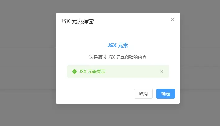
1.彈窗中直接傳入 jsx 節點元素
const ContentElement = (
          <div style="padding: 20px; text-align: center;">
            <h3 style="color: #409eff;">JSX 元素</h3>
            <p>這是通過 JSX 元素創建的內容</p>
            <ElAlert
              title="JSX 元素提示"
              type="success"
              show-icon
              style="margin-top: 15px;"
            />
          </div>
        )
創建彈窗
await createDialog({
    title: 'JSX 元素彈窗',
    element: ContentElement,
    width: '400px'
})
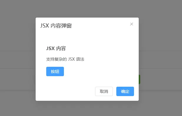
2.彈窗中直接放入 jsx 的內容
await createDialog({
          title: 'JSX 內容彈窗',
          jsxContent: (
            <div style="padding: 20px;">
              <h3 style="margin-bottom: 15px;">JSX 內容</h3>
              <p>支持複雜的 JSX 語法</p>
              <div style="margin-top: 15px;">
                <ElButton type="primary">按鈕</ElButton>
              </div>
            </div>
          ),
          width: '350px'
})
3.彈窗中塞入其他的組件、可以傳遞參數
        const MyJSXComponent = (props) => {
          const { title, message } = props
          const count = ref(0)

          return (
            <div style="padding: 20px;">
              <h4 style="color: #67c23a;">{title}</h4>
              <p>{message}</p>
              <div style="margin: 15px 0;">
                <p>計數: {count.value}</p>
                <ElButton onClick={() => count.value++}>增加</ElButton>
              </div>
            </div>
          )
        }
await createDialog({
title: 'JSX 組件彈窗',
jsxComponent: MyJSXComponent,
componentProps: {
title: '自定義組件',
message: '這是 JSX 組件'
},
width: '400px'
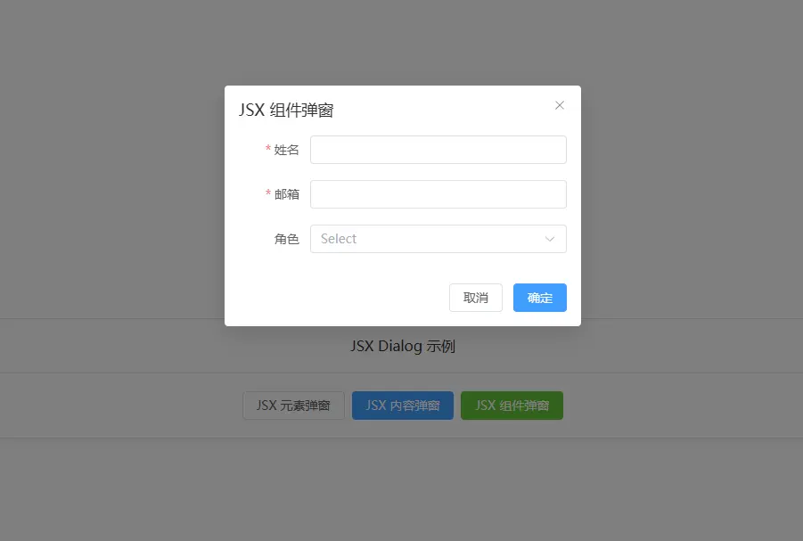
})4.彈窗中引入外部組件
import UserForm from './UserForm1.jsx'// components/UserForm.jsx
import { ref, reactive } from 'vue'
import { ElForm, ElFormItem, ElInput, ElSelect, ElOption } from 'element-plus'
export default {
name: 'UserForm',
props: {
initialName: String,
initialEmail: String,
initialRole: String
},
emits: ['confirm', 'close'],
setup(props, { emit }) {
const formRef = ref()
const formData = reactive({
name: props.initialName || '',
email: props.initialEmail || '',
role: props.initialRole || ''
})
const rules = {
name: [{ required: true, message: '請輸入姓名', trigger: 'blur' }],
email: [
{ required: true, message: '請輸入郵箱', trigger: 'blur' },
{ type: 'email', message: '請輸入正確的郵箱格式', trigger: 'blur' }
]
}
// 提交表單
const handleSubmit = () => {
return new Promise((resolve, reject) => {
formRef.value.validate((valid) => {
if (valid) {
// 模擬異步提交
setTimeout(() => {
resolve({ ...formData })
}, 1000)
} else {
reject(new Error('表單驗證失敗'))
}
})
})
}
const onSubmit = () => {
return handleSubmit()
}
return () => (
<ElForm
ref={formRef}
model={formData}
rules={rules}
labelWidth="80px">
<ElFormItem label="姓名" prop="name">
<ElInput v-model={formData.name} />
</ElFormItem>
<ElFormItem label="郵箱" prop="email">
<ElInput v-model={formData.email} />
</ElFormItem>
<ElFormItem label="角色" prop="role">
<ElSelect v-model={formData.role} style="width: 100%">
<ElOption label="管理員" value="admin" />
<ElOption label="用户" value="user" />
<ElOption label="訪客" value="guest" />
</ElSelect>
</ElFormItem>
</ElForm>
)
}
}
使用該組件
await createDialog({
          title: 'JSX 組件彈窗',
          jsxComponent: UserForm,
          componentProps: {
            title: '自定義組件',
            message: '這是 JSX 組件'
          },
          width: '400px'
        })
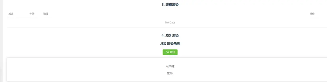
jsx 中帶計算屬性的組件
const UserProfile = (props) => {
  const { user } = props
  const fullName = computed(() => `${user.firstName} ${user.lastName}`)

  return (
    <div>
      <h3>{fullName.value}</h3>
      <p>Age: {user.age}</p>
    </div>
  )
}
封裝單獨的組件在某一個 jsx 文件中,可以導出
// 表單組件
export const LoginForm = () => {
  const form = reactive({
    username: '',
    password: ''
  })

  const rules = {
    username: [{ required: true, message: '請輸入用户名', trigger: 'blur' }],
    password: [{ required: true, message: '請輸入密碼', trigger: 'blur' }]
  }

  const handleSubmit = () => {
    console.log('提交表單:', form)
  }

  return (
    <ElForm model={form} rules={rules} labelWidth="80px">
      <ElFormItem label="用户名" prop="username">
        <ElInput v-model={form.username} />
      </ElFormItem>
      <ElFormItem label="密碼" prop="password">
        <ElInput v-model={form.password} type="password" />
      </ElFormItem>
      <ElFormItem>
        <ElButton type="primary" onClick={handleSubmit}>登錄</ElButton>
      </ElFormItem>
    </ElForm>
  )
}

// 表格組件
export const DataTable = (props) => {
  const { data, columns } = props

  return (
    <ElTable data={data} style="width: 100%">
      {columns.map(column => (
        <ElTableColumn
          key={column.prop}
          prop={column.prop}
          label={column.label}
          width={column.width}
        />
      ))}
    </ElTable>
  )
}
jsx 中使用插槽
// 具名插槽
const CardComponent = (props) => {
  const { header, default: defaultSlot, footer } = props

  return (
    <ElCard>
      {{
        header: () => header,
        default: () => defaultSlot,
        footer: () => footer
      }}
    </ElCard>
  )
}

// 使用插槽組件
const App = () => {
  return (
    <CardComponent>
      {{
        header: () => <h3>卡片標題</h3>,
        default: () => <p>卡片內容</p>,
        footer: () => <ElButton>操作按鈕</ElButton>
      }}
    </CardComponent>
  )
}
jsx 使用作用域插槽
// 列表組件帶作用域插槽
const ListComponent = (props) => {
  const { items, itemSlot } = props

  return (
    <ul>
      {items.map((item, index) => (
        <li key={item.id}>
          {itemSlot ? itemSlot({ item, index }) : item.name}
        </li>
      ))}
    </ul>
  )
}

// 使用作用域插槽
const App = () => {
  const items = [
    { id: 1, name: '項目1', status: 'active' },
    { id: 2, name: '項目2', status: 'inactive' }
  ]

  return (
    <ListComponent
      items={items}
      itemSlot={({ item, index }) => (
        <div>
          <span>{index + 1}. {item.name}</span>
          <ElTag type={item.status === 'active' ? 'success' : 'info'}>
            {item.status}
          </ElTag>
        </div>
      )}
    />
  )
}
jsx 中使用高階組件(HOC)
// 高階組件 - 添加加載狀態
const withLoading = (WrappedComponent) => {
  return (props) => {
    const { loading, ...restProps } = props

    return (
      <div>
        {loading && <div class="loading">加載中...</div>}
        <WrappedComponent {...restProps} />
      </div>
    )
  }
}

// 使用高階組件
const DataList = (props) => {
  const { data } = props

  return (
    <ul>
      {data.map(item => (
        <li key={item.id}>{item.name}</li>
      ))}
    </ul>
  )
}

const DataListWithLoading = withLoading(DataList)
jsx 中封裝動態組件
// 動態組件渲染
const DynamicComponent = (props) => {
  const { component: Component, ...restProps } = props

  return Component ? <Component {...restProps} /> : null
}

// 使用動態組件
const App = () => {
  const currentComponent = ref('Button')

  const components = {
    Button: ElButton,
    Input: ElInput,
    Select: ElSelect
  }

  return (
    <div>
      <ElRadioGroup v-model={currentComponent.value}>
        {Object.keys(components).map(name => (
          <ElRadio key={name} label={name}>{name}</ElRadio>
        ))}
      </ElRadioGroup>

      <DynamicComponent
        component={components[currentComponent.value]}
        type="primary"
      >
        動態按鈕
      </DynamicComponent>
    </div>
  )
}
hook 與 jsx 結合起來使用
// 自定義 Hook
const useCounter = (initialValue = 0) => {
  const count = ref(initialValue)

  const increment = () => count.value++
  const decrement = () => count.value--
  const reset = () => count.value = initialValue

  return { count, increment, decrement, reset }
}

// 使用自定義 Hook 的 JSX 組件
const CounterComponent = (props) => {
  const { initial = 0 } = props
  const { count, increment, decrement, reset } = useCounter(initial)

  return (
    <div class="counter">
      <h3>計數器: {count.value}</h3>
      <ElButton onClick={increment}>+</ElButton>
      <ElButton onClick={decrement}>-</ElButton>
      <ElButton onClick={reset}>重置</ElButton>
    </div>
  )
}
使用 jsx 動態渲染其他的字符串模板組件
封裝StringRenderer.jsx
import { defineComponent, h, resolveComponent, computed } from 'vue'
import * as ElementPlus from 'element-plus'

export default defineComponent({
  name: 'StringRenderer',
  props: {
    // HTML 字符串內容
    html: {
      type: String,
      default: ''
    },
    // JSX 元素
    jsx: {
      type: [Object, Function, String],
      default: null
    },
    // 數據上下文
    context: {
      type: Object,
      default: () => ({})
    }
  },
  setup(props) {
    // 組件映射表
    const componentMap = {
      'el-button': ElementPlus.ElButton,
      'el-form': ElementPlus.ElForm,
      'el-form-item': ElementPlus.ElFormItem,
      'el-input': ElementPlus.ElInput,
      'el-table': ElementPlus.ElTable,
      'el-table-column': ElementPlus.ElTableColumn,
      'el-dialog': ElementPlus.ElDialog,
      'el-card': ElementPlus.ElCard,
      'el-alert': ElementPlus.ElAlert,
      'el-tag': ElementPlus.ElTag,
      'el-select': ElementPlus.ElSelect,
      'el-option': ElementPlus.ElOption,
      'el-checkbox': ElementPlus.ElCheckbox,
      'el-radio': ElementPlus.ElRadio,
      'el-switch': ElementPlus.ElSwitch,
      'el-input-number': ElementPlus.ElInputNumber,
      'el-date-picker': ElementPlus.ElDatePicker,
      'el-time-picker': ElementPlus.ElTimePicker,
      'el-upload': ElementPlus.ElUpload,
      'el-progress': ElementPlus.ElProgress,
      'el-pagination': ElementPlus.ElPagination,
      'el-breadcrumb': ElementPlus.ElBreadcrumb,
      'el-breadcrumb-item': ElementPlus.ElBreadcrumbItem,
      'el-tabs': ElementPlus.ElTabs,
      'el-tab-pane': ElementPlus.ElTabPane,
      'el-steps': ElementPlus.ElSteps,
      'el-step': ElementPlus.ElStep,
      'el-collapse': ElementPlus.ElCollapse,
      'el-collapse-item': ElementPlus.ElCollapseItem,
      'el-dropdown': ElementPlus.ElDropdown,
      'el-dropdown-menu': ElementPlus.ElDropdownMenu,
      'el-dropdown-item': ElementPlus.ElDropdownItem,
      'el-menu': ElementPlus.ElMenu,
      'el-menu-item': ElementPlus.ElMenuItem,
      'el-sub-menu': ElementPlus.ElSubMenu,
      'el-drawer': ElementPlus.ElDrawer,
      'el-popover': ElementPlus.ElPopover,
      'el-tooltip': ElementPlus.ElTooltip,
      'el-popconfirm': ElementPlus.ElPopconfirm,
      'el-descriptions': ElementPlus.ElDescriptions,
      'el-descriptions-item': ElementPlus.ElDescriptionsItem,
      'el-result': ElementPlus.ElResult,
      'el-empty': ElementPlus.ElEmpty,
      'el-skeleton': ElementPlus.ElSkeleton,
      'el-statistic': ElementPlus.ElStatistic,
      'el-countdown': ElementPlus.ElCountdown,
      'el-watermark': ElementPlus.ElWatermark,
      'el-segmented': ElementPlus.ElSegmented,
      'el-affix': ElementPlus.ElAffix,
      'el-backtop': ElementPlus.ElBacktop
    }

    // 解析屬性
    const parseAttributes = (element) => {
      const props = {}
      const events = {}

      Array.from(element.attributes).forEach(attr => {
        const name = attr.name
        const value = attr.value

        // 處理事件綁定
        if (name.startsWith('@') || name.startsWith('v-on:')) {
          const eventName = name.replace(/^(@|v-on:)/, '')
          // 嘗試解析為函數
          if (typeof props.context?.[value] === 'function') {
            events[`on${eventName.charAt(0).toUpperCase() + eventName.slice(1)}`] =
              props.context[value]
          } else {
            // 如果不是函數,創建一個簡單的事件處理器
            events[`on${eventName.charAt(0).toUpperCase() + eventName.slice(1)}`] =
              () => {
                if (props.context?.[value]) {
                  props.context[value]()
                } else {
                  console.warn(`事件處理器 ${value} 未找到`)
                }
              }
          }
        }
        // 處理屬性綁定
        else if (name.startsWith(':') || name.startsWith('v-bind:')) {
          const propName = name.replace(/^(:|v-bind:)/, '')
          if (props.context?.[value] !== undefined) {
            props[propName] = props.context[value]
          }
        }
        // 處理普通屬性
        else if (name === 'class') {
          props.className = value
        } else if (name === 'style') {
          props.style = parseStyle(value)
        } else {
          props[name] = value
        }
      })

      return { ...props, ...events }
    }

    // 解析樣式字符串
    const parseStyle = (styleString) => {
      if (!styleString) return {}

      const style = {}
      const rules = styleString.split(';')

      rules.forEach(rule => {
        const [key, value] = rule.split(':')
        if (key && value) {
          const formattedKey = key.trim().replace(/-([a-z])/g, (g) => g[1].toUpperCase())
          style[formattedKey] = value.trim()
        }
      })

      return style
    }

    // 遞歸解析 DOM 節點
    const parseDomNode = (node) => {
      // 文本節點
      if (node.nodeType === 3) {
        const text = node.textContent?.trim()
        return text || null
      }

      // 元素節點
      if (node.nodeType === 1) {
        const tagName = node.tagName.toLowerCase()

        // 獲取組件或原生元素
        let Component = componentMap[tagName] || tagName

        // 解析屬性
        const props = parseAttributes(node)

        // 解析子節點
        const children = []
        Array.from(node.childNodes).forEach(childNode => {
          const childResult = parseDomNode(childNode)
          if (childResult !== null) {
            children.push(childResult)
          }
        })

        // 處理特殊屬性和指令
        const processedProps = { ...props }

        // 處理 v-if
        if (node.getAttribute('v-if')) {
          const condition = node.getAttribute('v-if')
          const conditionValue = props.context?.[condition] ?? eval(`(${condition})`)
          if (!conditionValue) {
            return null
          }
        }

        // 處理 v-show
        if (node.getAttribute('v-show')) {
          const condition = node.getAttribute('v-show')
          const conditionValue = props.context?.[condition] ?? eval(`(${condition})`)
          processedProps.style = {
            ...processedProps.style,
            display: conditionValue ? '' : 'none'
          }
        }

        return h(Component, processedProps, children.length > 0 ? children : null)
      }

      return null
    }

    // 解析 HTML 字符串
    const parseHtmlString = (htmlString) => {
      if (!htmlString) return null

      try {
        // 創建臨時容器
        const temp = document.createElement('div')
        temp.innerHTML = htmlString

        // 解析所有子節點
        const result = []
        Array.from(temp.childNodes).forEach(node => {
          const parsed = parseDomNode(node)
          if (parsed !== null) {
            result.push(parsed)
          }
        })

        return result.length === 1 ? result[0] : (result.length > 0 ? result : null)
      } catch (error) {
        console.error('HTML 解析錯誤:', error)
        return h('div', '渲染錯誤: ' + error.message)
      }
    }

    // 渲染內容
    const renderContent = computed(() => {
      // 優先渲染 JSX
      if (props.jsx) {
        if (typeof props.jsx === 'function') {
          return props.jsx(props.context)
        }
        return props.jsx
      }

      // 渲染 HTML 字符串
      if (props.html) {
        return parseHtmlString(props.html)
      }

      return null
    })

    return () => {
      return renderContent.value || h('div', '無內容')
    }
  }
})
使用 示例
    const htmlContent = ref(`
      <div>
        <el-button type="primary" @click="handleClick">測試按鈕</el-button>
        <el-alert title="成功提示" type="success" show-icon style="margin-top: 10px;"></el-alert>
      </div>
    `)
<StringRenderer html={htmlContent.value} />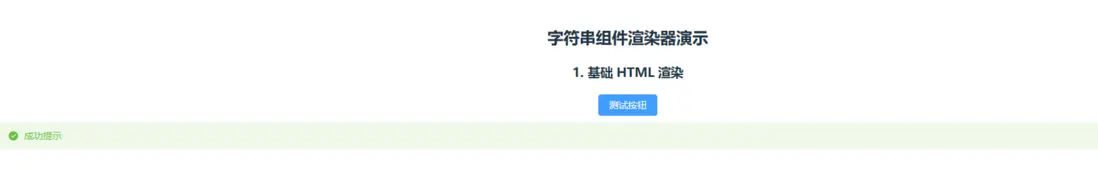
渲染更加複雜的組件
封裝AdvancedStringRenderer.jsx
import { defineComponent, ref, watch, computed, h, createVNode } from 'vue'
import * as ElementPlus from 'element-plus'

export default defineComponent({
  name: 'AdvancedStringRenderer',
  props: {
    // 模板字符串
    template: {
      type: String,
      default: ''
    },
    // JSX 元素
    jsx: {
      type: [Object, Function],
      default: null
    },
    // 數據上下文
    data: {
      type: Object,
      default: () => ({})
    },
    // 方法上下文
    methods: {
      type: Object,
      default: () => ({})
    },
    // 渲染模式
    mode: {
      type: String,
      default: 'auto', // auto | template | jsx | html
      validator: (value) => ['auto', 'template', 'jsx', 'html'].includes(value)
    }
  },
  setup(props) {
    // 組件映射表
    const componentMap = {
      'el-button': ElementPlus.ElButton,
      'el-form': ElementPlus.ElForm,
      'el-form-item': ElementPlus.ElFormItem,
      'el-input': ElementPlus.ElInput,
      'el-table': ElementPlus.ElTable,
      'el-table-column': ElementPlus.ElTableColumn,
      'el-dialog': ElementPlus.ElDialog,
      'el-card': ElementPlus.ElCard,
      'el-alert': ElementPlus.ElAlert,
      'el-tag': ElementPlus.ElTag,
      // ... 其他組件映射
    }

    // 檢測渲染模式
    const renderMode = computed(() => {
      if (props.mode !== 'auto') return props.mode

      if (props.jsx) return 'jsx'
      if (props.template && props.template.trim().startsWith('<template>')) return 'template'
      if (props.template && /<[^>]+>/.test(props.template)) return 'html'
      return 'html'
    })

    // 解析 HTML 字符串
    const parseHtmlString = (htmlString) => {
      if (!htmlString) return null

      // 創建臨時解析器
      const parser = new DOMParser()
      const doc = parser.parseFromString(htmlString, 'text/html')

      const convertNode = (node) => {
        if (node.nodeType === 3) {
          // 文本節點
          const text = node.textContent.trim()
          return text ? text : null
        }

        if (node.nodeType === 1) {
          // 元素節點
          const tag = node.tagName.toLowerCase()
          const props = {}
          const children = []

          // 處理屬性
          Array.from(node.attributes).forEach(attr => {
            const name = attr.name
            const value = attr.value

            // 處理 Vue 特殊屬性
            if (name === 'v-if') {
              // 簡單的條件渲染支持
              const condition = props.data?.[value] || false
              if (!condition) return null
            } else if (name === 'v-for') {
              // 簡單的循環支持
              // 這裏可以擴展更復雜的循環邏輯
            } else if (name.startsWith('@') || name.startsWith('v-on:')) {
              // 事件處理
              const eventName = name.replace(/^(@|v-on:)/, '')
              const handlerName = value
              if (props.methods?.[handlerName]) {
                props[`on${eventName.charAt(0).toUpperCase() + eventName.slice(1)}`] =
                  props.methods[handlerName]
              }
            } else if (name.startsWith(':') || name.startsWith('v-bind:')) {
              // 屬性綁定
              const propName = name.replace(/^(:|v-bind:)/, '')
              const dataKey = value
              if (props.data?.[dataKey] !== undefined) {
                props[propName] = props.data[dataKey]
              }
            } else if (name === 'class') {
              props.className = value
            } else {
              props[name] = value
            }
          })

          // 處理子節點
          Array.from(node.childNodes).forEach(child => {
            const childResult = convertNode(child)
            if (childResult !== null) {
              children.push(childResult)
            }
          })

          // 獲取組件或使用原生標籤
          const Component = componentMap[tag] || tag
          return h(Component, props, children.length > 0 ? children : null)
        }

        return null
      }

      const result = []
      Array.from(doc.body.childNodes).forEach(node => {
        const vnode = convertNode(node)
        if (vnode !== null) {
          result.push(vnode)
        }
      })

      return result.length === 1 ? result[0] : (result.length > 0 ? result : null)
    }

    // 編譯 Vue 模板
    const compileVueTemplate = async (templateString, data = {}, methods = {}) => {
      try {
        // 這裏可以使用更復雜的模板編譯邏輯
        // 目前提供簡化的實現
        return templateString
      } catch (error) {
        console.error('模板編譯失敗:', error)
        return `<div>模板編譯錯誤: ${error.message}</div>`
      }
    }

    return () => {
      // JSX 模式
      if (renderMode.value === 'jsx' && props.jsx) {
        return typeof props.jsx === 'function'
          ? props.jsx(props.data, props.methods)
          : props.jsx
      }

      // 模板模式
      if (renderMode.value === 'template' && props.template) {
        // 這裏可以實現更復雜的模板編譯
        return h('div', '模板編譯功能待實現')
      }

      // HTML 模式
      if (renderMode.value === 'html' && props.template) {
        try {
          return parseHtmlString(props.template) || h('div', props.template)
        } catch (error) {
          console.error('HTML 解析錯誤:', error)
          return h('div', `渲染錯誤: ${error.message}`)
        }
      }

      // 默認渲染
      return h('div', props.template || '無內容')
    }
  }
})
具體使用-渲染表單
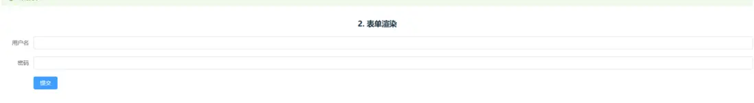
    const formHtml = ref(`
      <el-form :model="form" label-width="80px">
        <el-form-item label="用户名">
          <el-input v-model="form.username"></el-input>
        </el-form-item>
        <el-form-item label="密碼">
          <el-input v-model="form.password" type="password"></el-input>
        </el-form-item>
        <el-form-item>
          <el-button type="primary" @click="handleSubmit">提交</el-button>
        </el-form-item>
      </el-form>
    `)
<AdvancedStringRenderer
            template={formHtml.value}
            data={contextData}
            methods={contextMethods}
            mode="html"
          />
渲染表格
    const tableHtml = ref(`
      <el-table :data="tableData" style="width: 100%">
        <el-table-column prop="name" label="姓名" width="120"></el-table-column>
        <el-table-column prop="age" label="年齡" width="80"></el-table-column>
        <el-table-column prop="address" label="地址"></el-table-column>
        <el-table-column label="操作" width="150">
          <template #default="scope">
            <el-button size="small" @click="handleEdit(scope.$index, scope.row)">編輯</el-button>
            <el-button size="small" type="danger" @click="handleDelete(scope.$index, scope.row)">刪除</el-button>
          </template>
        </el-table-column>
      </el-table>
    `)
<AdvancedStringRenderer
jsx={jsxContent}
data={contextData}
methods={contextMethods}
mode="jsx"
/>
🚀 jsx 更高階用法
1. 條件渲染和邏輯控制
// 條件渲染工廠函數
const ConditionalRenderer = defineComponent({
  props: {
    condition: Boolean,
    then: [Object, Function],
    else: [Object, Function]
  },
  setup(props) {
    return () => props.condition
      ? (typeof props.then === 'function' ? props.then() : props.then)
      : (props.else ? (typeof props.else === 'function' ? props.else() : props.else) : null)
  }
})

// 使用示例
const App = () => (
  <div>
    <ConditionalRenderer
      condition={user.isLoggedIn}
      then={() => <UserProfile user={user} />}
      else={() => <LoginButton />}
    />
  </div>
)
2. 高階組件 (HOC) 模式
// 創建高階組件工廠
const withLoading = (WrappedComponent) => {
  return defineComponent({
    props: WrappedComponent.props,
    setup(props, { slots }) {
      const loading = ref(true)

      onMounted(() => {
        // 模擬異步加載
        setTimeout(() => {
          loading.value = false
        }, 1000)
      })

      return () => loading.value
        ? h('div', '加載中...')
        : h(WrappedComponent, props, slots)
    }
  })
}

// 使用高階組件
const MyComponent = defineComponent({
  setup() {
    return () => <div>我的內容</div>
  }
})

const MyComponentWithLoading = withLoading(MyComponent)
3. Render Props 模式
// 數據獲取組件
const DataFetcher = defineComponent({
  props: {
    url: String,
    children: Function
  },
  setup(props) {
    const data = ref(null)
    const loading = ref(true)
    const error = ref(null)

    onMounted(async () => {
      try {
        const response = await fetch(props.url)
        data.value = await response.json()
      } catch (err) {
        error.value = err
      } finally {
        loading.value = false
      }
    })

    return () => props.children({ data: data.value, loading: loading.value, error: error.value })
  }
})

// 使用示例
const App = () => (
  <DataFetcher url="/api/users">
    {({ data, loading, error }) => {
      if (loading) return <div>加載中...</div>
      if (error) return <div>錯誤: {error.message}</div>
      return <UserList users={data} />
    }}
  </DataFetcher>
)
4. 動態組件工廠
// 動態組件生成器
const createComponent = (config) => {
  return defineComponent({
    props: config.props || {},
    setup(props, { emit, slots }) {
      const state = reactive(config.state || {})

      // 綁定方法
      const methods = {}
      Object.keys(config.methods || {}).forEach(key => {
        methods[key] = config.methods[key].bind({ ...state, ...methods, emit })
      })

      // 計算屬性
      const computedProps = {}
      Object.keys(config.computed || {}).forEach(key => {
        computedProps[key] = computed(() => config.computed[key].call({ ...state, ...methods }))
      })

      return () => {
        const context = { ...state, ...methods, ...computedProps, props, slots }
        return typeof config.render === 'function'
          ? config.render(context)
          : config.render
      }
    }
  })
}

// 使用示例
const CounterComponent = createComponent({
  state: { count: 0 },
  methods: {
    increment() {
      this.count++
    },
    decrement() {
      this.count--
    }
  },
  computed: {
    isPositive() {
      return this.count > 0
    }
  },
  render(ctx) {
    return (
      <div>
        <h3>計數器: {ctx.count}</h3>
        <button onClick={ctx.increment}>+</button>
        <button onClick={ctx.decrement}>-</button>
        <p style={{ color: ctx.isPositive ? 'green' : 'red' }}>
          {ctx.isPositive ? '正數' : '非正數'}
        </p>
      </div>
    )
  }
})
5. JSX 模板引擎
// JSX 模板引擎
const TemplateEngine = defineComponent({
  props: {
    template: Function,
    data: Object,
    helpers: Object
  },
  setup(props) {
    const context = computed(() => ({
      ...props.data,
      ...props.helpers,
      // 內置幫助函數
      if: (condition, thenValue, elseValue = null) => condition ? thenValue : elseValue,
      map: (array, callback) => array.map(callback),
      filter: (array, callback) => array.filter(callback),
      formatDate: (date) => new Date(date).toLocaleDateString(),
      currency: (amount) => `¥${amount.toFixed(2)}`,
      truncate: (str, length) => str.length > length ? str.substring(0, length) + '...' : str
    }))

    return () => props.template(context.value)
  }
})

// 使用示例
const userTemplate = (ctx) => (
  <div class="user-card">
    <h2>{ctx.user.name}</h2>
    <p>{ctx.truncate(ctx.user.bio, 100)}</p>
    <div class="stats">
      <span>註冊時間: {ctx.formatDate(ctx.user.createdAt)}</span>
      <span>餘額: {ctx.currency(ctx.user.balance)}</span>
    </div>
    {ctx.if(
      ctx.user.posts.length > 0,
      <div class="posts">
        <h3>文章列表</h3>
        {ctx.map(ctx.user.posts, post => (
          <div key={post.id} class="post-item">
            <h4>{post.title}</h4>
            <p>{ctx.truncate(post.content, 50)}</p>
          </div>
        ))}
      </div>,
      <p>暫無文章</p>
    )}
  </div>
)

const App = () => (
  <TemplateEngine
    template={userTemplate}
    data={{
      user: {
        name: '張三',
        bio: '這是一個很長的個人簡介,用來測試截斷功能...',
        createdAt: '2023-01-01',
        balance: 1234.56,
        posts: [
          { id: 1, title: '第一篇文章', content: '文章內容...' },
          { id: 2, title: '第二篇文章', content: '更多內容...' }
        ]
      }
    }}
    helpers={{
      customHelper: (value) => `自定義處理: ${value}`
    }}
  />
)
6. 動畫和過渡效果
// 動畫容器組件
const AnimatedContainer = defineComponent({
  props: {
    animation: {
      type: String,
      default: 'fadeIn'
    },
    duration: {
      type: Number,
      default: 300
    },
    children: [Object, Function]
  },
  setup(props) {
    const isVisible = ref(true)
    const animationClass = ref('')

    const animations = {
      fadeIn: {
        enter: 'animate__fadeIn',
        leave: 'animate__fadeOut'
      },
      slideIn: {
        enter: 'animate__slideInUp',
        leave: 'animate__slideOutDown'
      },
      bounce: {
        enter: 'animate__bounceIn',
        leave: 'animate__bounceOut'
      }
    }

    const show = () => {
      isVisible.value = true
      animationClass.value = animations[props.animation].enter
    }

    const hide = () => {
      animationClass.value = animations[props.animation].leave
      setTimeout(() => {
        isVisible.value = false
      }, props.duration)
    }

    provide('animate', { show, hide })

    return () => isVisible.value ? (
      <div
        class={`animate__animated ${animationClass.value}`}
        style={{ animationDuration: `${props.duration}ms` }}
      >
        {typeof props.children === 'function' ? props.children() : props.children}
      </div>
    ) : null
  }
})

// 可切換內容組件
const ToggleableContent = defineComponent({
  props: {
    title: String,
    children: [Object, Function]
  },
  setup(props) {
    const showContent = ref(false)

    return () => (
      <div>
        <button onClick={() => showContent.value = !showContent.value}>
          {props.title} ({showContent.value ? '收起' : '展開'})
        </button>
        <AnimatedContainer animation="slideIn" duration={500}>
          {showContent.value && (
            typeof props.children === 'function' ? props.children() : props.children
          )}
        </AnimatedContainer>
      </div>
    )
  }
})
7. 函數式編程 JSX
// 函數式組件組合器
const pipe = (...fns) => (value) => fns.reduce((acc, fn) => fn(acc), value)

const compose = (...fns) => (value) => fns.reduceRight((acc, fn) => fn(acc), value)

// JSX 組件組合
const withState = (initialState) => (Component) => {
  return defineComponent({
    setup() {
      const state = reactive(initialState)
      const setState = (newState) => Object.assign(state, newState)

      return () => h(Component, { state, setState })
    }
  })
}

const withEffects = (effects) => (Component) => {
  return defineComponent({
    setup(props, { emit }) {
      onMounted(() => {
        effects.forEach(effect => effect())
      })

      return (componentProps) => h(Component, { ...componentProps, emit })
    }
  })
}

// 使用函數式組合
const EnhancedComponent = pipe(
  withState({ count: 0, name: 'Vue' }),
  withEffects([() => console.log('組件已掛載')])
)(({ state, setState }) => (
  <div>
    <h1>Hello {state.name}!</h1>
    <p>Count: {state.count}</p>
    <button onClick={() => setState({ count: state.count + 1 })}>
      Increment
    </button>
  </div>
))
8. JSX DSL (領域特定語言)
// 創建一個類似 CSS-in-JS 的 DSL
const styled = (tag) => (styles) => {
  return defineComponent({
    props: {
      children: [Object, Function, String]
    },
    setup(props) {
      const styleString = Object.entries(styles)
        .map(([key, value]) => `${key.replace(/[A-Z]/g, match => `-${match.toLowerCase()}`)}: ${value}`)
        .join('; ')

      return () => h(tag, { style: styleString }, props.children)
    }
  })
}

// 使用示例
const StyledButton = styled('button')({
  backgroundColor: '#007bff',
  color: 'white',
  border: 'none',
  padding: '10px 20px',
  borderRadius: '4px',
  cursor: 'pointer',
  transition: 'background-color 0.3s'
})

const StyledCard = styled('div')({
  backgroundColor: 'white',
  borderRadius: '8px',
  padding: '20px',
  boxShadow: '0 2px 10px rgba(0,0,0,0.1)',
  margin: '20px 0'
})

// 使用 DSL 組件
const App = () => (
  <div>
    <StyledCard>
      <h2>歡迎使用</h2>
      <StyledButton onClick={() => alert('點擊了!')}>
        點擊我
      </StyledButton>
    </StyledCard>
  </div>
)
9. 響應式數據綁定 DSL
// 創建響應式綁定系統
const bind = (data, key) => {
  return {
    modelValue: data[key],
    'onUpdate:modelValue': (value) => {
      data[key] = value
    }
  }
}

// 計算屬性綁定
const compute = (fn) => {
  return computed(fn)
}

// 使用示例
const ReactiveForm = defineComponent({
  setup() {
    const formData = reactive({
      username: '',
      email: '',
      age: 18
    })

    const validations = reactive({
      usernameValid: compute(() => formData.username.length >= 3),
      emailValid: compute(() => /\S+@\S+\.\S+/.test(formData.email)),
      isAdult: compute(() => formData.age >= 18)
    })

    return () => (
      <div>
        <ElFormItem label="用户名">
          <ElInput {...bind(formData, 'username')} />
          {!validations.usernameValid.value && (
            <div style="color: red; font-size: 12px;">用户名至少3個字符</div>
          )}
        </ElFormItem>

        <ElFormItem label="郵箱">
          <ElInput {...bind(formData, 'email')} />
          {!validations.emailValid.value && (
            <div style="color: red; font-size: 12px;">請輸入有效的郵箱</div>
          )}
        </ElFormItem>

        <ElFormItem label="年齡">
          <ElInputNumber {...bind(formData, 'age')} min={0} max={120} />
          <div style={{ color: validations.isAdult.value ? 'green' : 'orange' }}>
            {validations.isAdult.value ? '成年人' : '未成年人'}
          </div>
        </ElFormItem>

        <ElButton
          type="primary"
          disabled={!validations.usernameValid.value || !validations.emailValid.value}
          onClick={() => console.log('提交數據:', formData)}
        >
          提交
        </ElButton>
      </div>
    )
  }
})
10. JSX 模式匹配
// 模式匹配組件
const Match = defineComponent({
  props: {
    value: [String, Number, Boolean, Object],
    children: Array
  },
  setup(props) {
    const matchCase = (pattern, render) => {
      if (typeof pattern === 'function') {
        return pattern(props.value) ? render(props.value) : null
      }
      return pattern === props.value ? render(props.value) : null
    }

    return () => {
      for (let child of props.children) {
        if (child.type === 'case') {
          const result = matchCase(child.props.pattern, child.props.children)
          if (result) return result
        } else if (child.type === 'default') {
          return child.props.children(props.value)
        }
      }
      return null
    }
  }
})

// 使用示例
const StatusDisplay = ({ status }) => (
  <Match value={status}>
    {{
      type: 'case',
      props: { pattern: 'success', children: () => <ElAlert type="success" title="操作成功" /> }
    }}
    {{
      type: 'case',
      props: { pattern: 'error', children: () => <ElAlert type="error" title="操作失敗" /> }
    }}
    {{
      type: 'case',
      props: {
        pattern: (value) => typeof value === 'string' && value.includes('warning'),
        children: (value) => <ElAlert type="warning" title={`警告: ${value}`} />
      }
    }}
    {{
      type: 'default',
      props: { children: (value) => <ElAlert type="info" title={`未知狀態: ${value}`} /> }
    }}
  </Match>
)